Project Name: Outspoken
Outspoken is a social platform for open-minded debate.
Problem Statement:
Social media has had a tendency to turn into platform for debate. People end up voicing their thoughts out without a proper means of organizing them. Conversations function in a more linear manner and contesting ideas bury each other in noise instead of critical thought.
Tools used:
Azure, Photoshop
Team:
Winona Lim, Jerome Po, Nathan Reyes, Raven Sy, Dana Sy-Ching, Bianca Tarun
Role:
CDO, UX/UI Research and Design, Branding
Interviews
The top social media companies, namely Facebook, Instagram, and Twitter, have become places for people to voice out their opinions. Amongst our 72 interviewees, 100% of the respondents used Facebook, 73% used Twitter, and 58% used Instagram. 40% of respondents spent more than 5 hours a day on social media, while 30% spent between 3-5 hours a day.
Social media conversations about highly contested topics were viewed by out respondents as “toxic.” Despite the amount of time users spend on social media, we were able to identify an absence in people's ability to express their thoughts anonymously while engaging in critical conversation.
From our research, our team was able to see a pattern in user’s desire for anonymity in the expression of their thoughts. To facilitate discussion, we found the need for a communicative layout that easily depicts other’s opinions.
UX Research
We found a variety of websites that served as debate platforms and analyzed their features.
Idebate.org
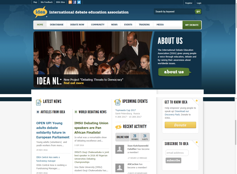
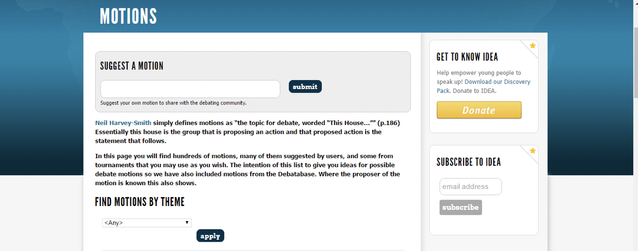
A website by the International Debate Organization whose aim is to educate users about debate. Given the context of educating people, their website has a features like a database of debates, ability to choose or suggest a motion for debate, groups, badges, and training.
Given that it is for education, its interface contains a huge amount of information that serves a specific community.
We learned that though we have a different product and mission, there was much to observe about their debate user-flow. The user is given both an ability to initiate and participate.
Debate.org
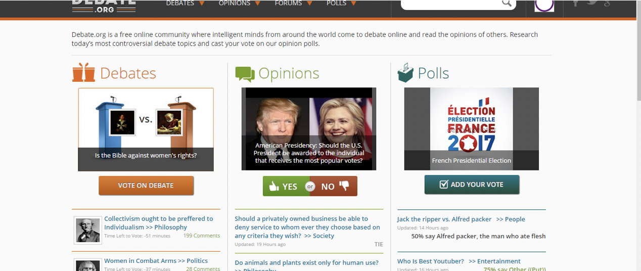
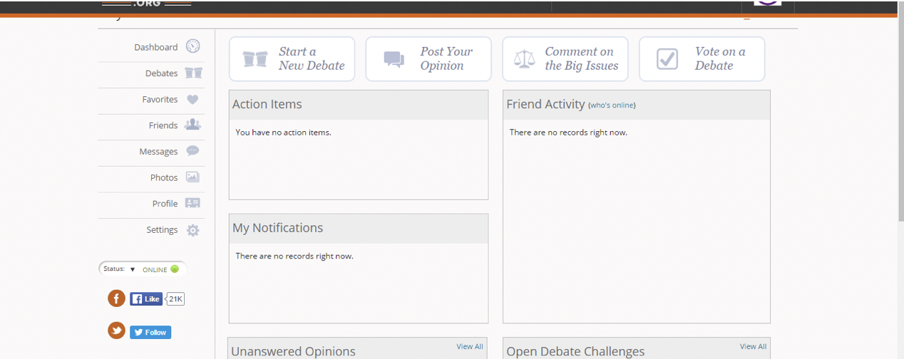
Debate.org is a platform for debate. Features include giving users the ability to initiate a debate, participate in a debate, voice their opinions, and vote. Though it granted users a wide variety of options, their interface seemed a bit too overwhelming because there were too many divisions (debates, opinions, polls) that diverged further and further, causing topics to be split into 3, potentially causing redundancy in data. We took this into account in creating our interface.
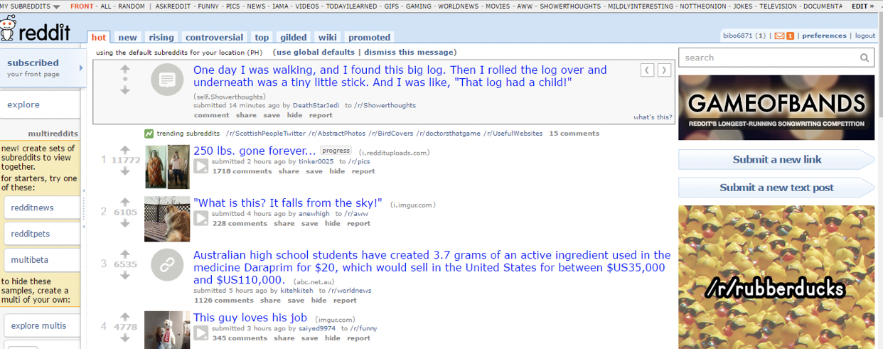
The last website we assessed was reddit. It’s features included upvotes and thread replies. Again, the many unclear categories made the webpage hard to navigate. Though it isn’t a debate platform outright, it’s reply function allows people to communicate. The existence of subreddits is overwhelming, but it was interesting to notice how many possible categories for conversation people had.
Outspoken Wireframe and Storyboard
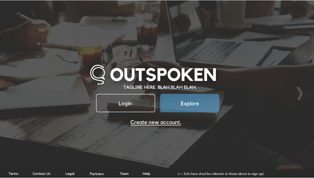
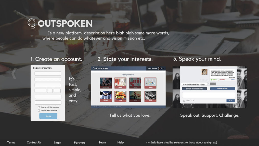
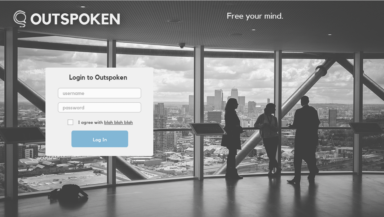
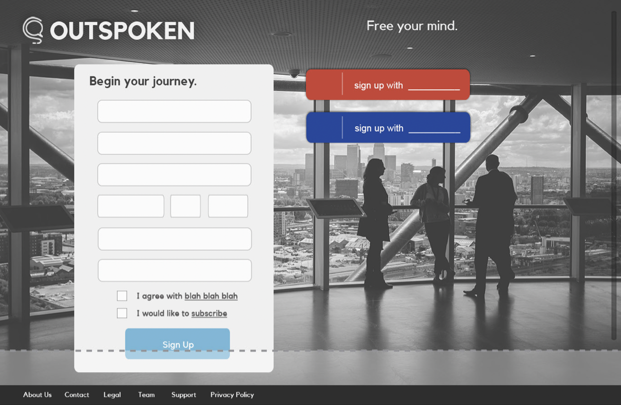
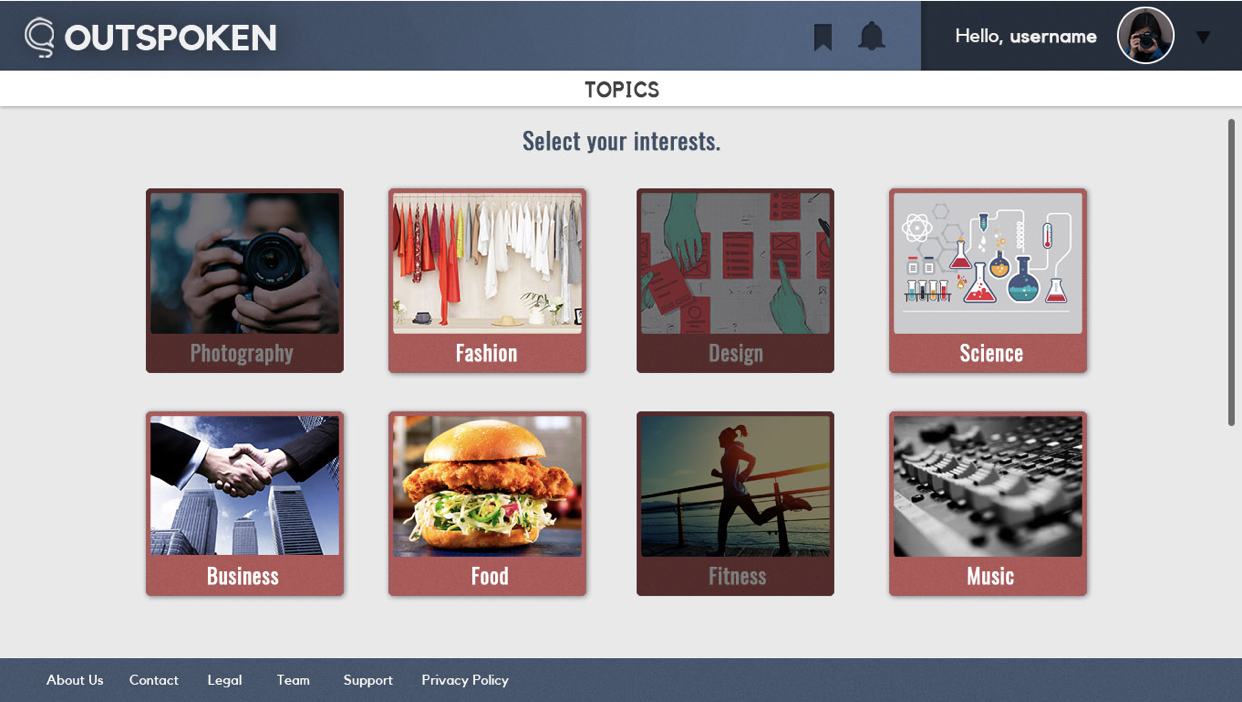
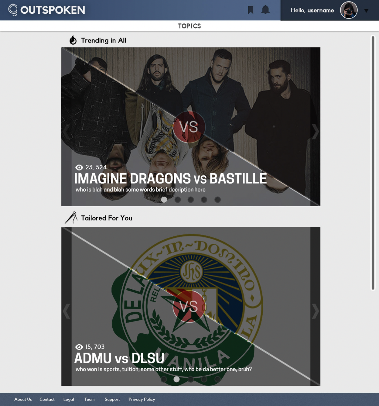
We created standard Login and Sign Up pages. After signing up, the user will then be redirected to a selection of topics of interest. After this, they will be able to participate in debates. To make things easy to navigate, we decided to create a simple landing page of trending topics.
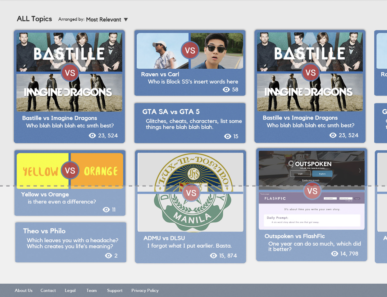
Due to its identity as a social media platform, we also created a dashboard displaying topics specific to the user. We placed a topic selection pop-up to streamline the process of identifying existing topics (so that it’s not a guessing game). This also allows the user to focus on one topic at a time as their personal dashboard will already cover a variety of topics.
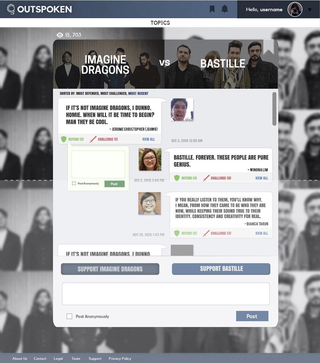
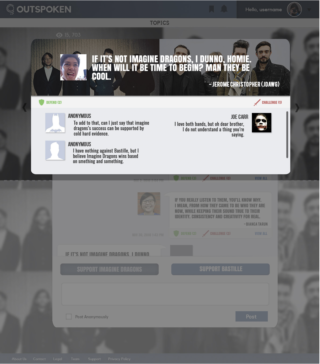
The final element is the debate page. It was crucial to make clear the division between two sides. This is created by a split straight down the middle that makes it clear which comments or opinions are for or against. People are then able to discuss further by either defending or challenging an opinion that stands out to them. The ability to post anonymously is also provided to protect user’s privacy. People would still, however, have to sign up for an account to ensure agreement to terms and conditions, and increase accountability.
Outspoken Prototype
Branding
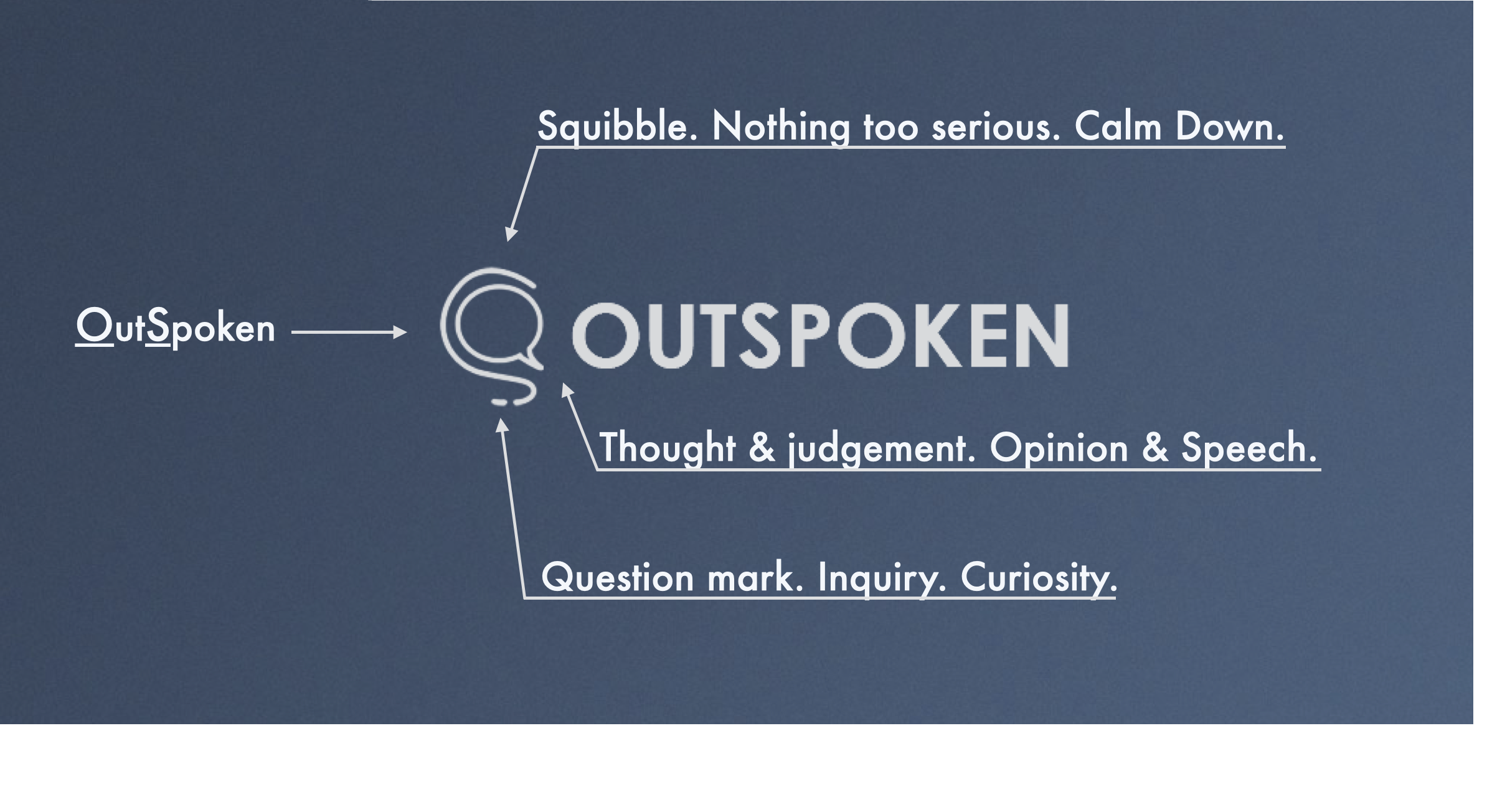
Outspoken is branded as a fun social media platform for debate as anything more serious will seem a bit more exclusive and may cause for psychological perceptions of being personally attacked. Blue is the brand’s main color to promote a sense of calm in contrast to red elements that signify “debate.”


