Project: DepEd Commons Forum
The DepEd Commons Forum is a web app that supplements distance learning by providing a platform for Filipino public school students to communicate questions to their teachers.
Tools used:
Miro, Figma
Process Outline:
Research -> Analyze -> Pivot -> Ideate -> Prototype
Roles:
UX Research, UX/UI Design
Presentation Deck:
Preliminary Research
For this project, I wanted to explore the less evident issues covid has caused in education. With the internet flooded with zoom fails, it becomes easy to forget about those without access to the same technology. This led me to explore the Philippine public education system post-covid.
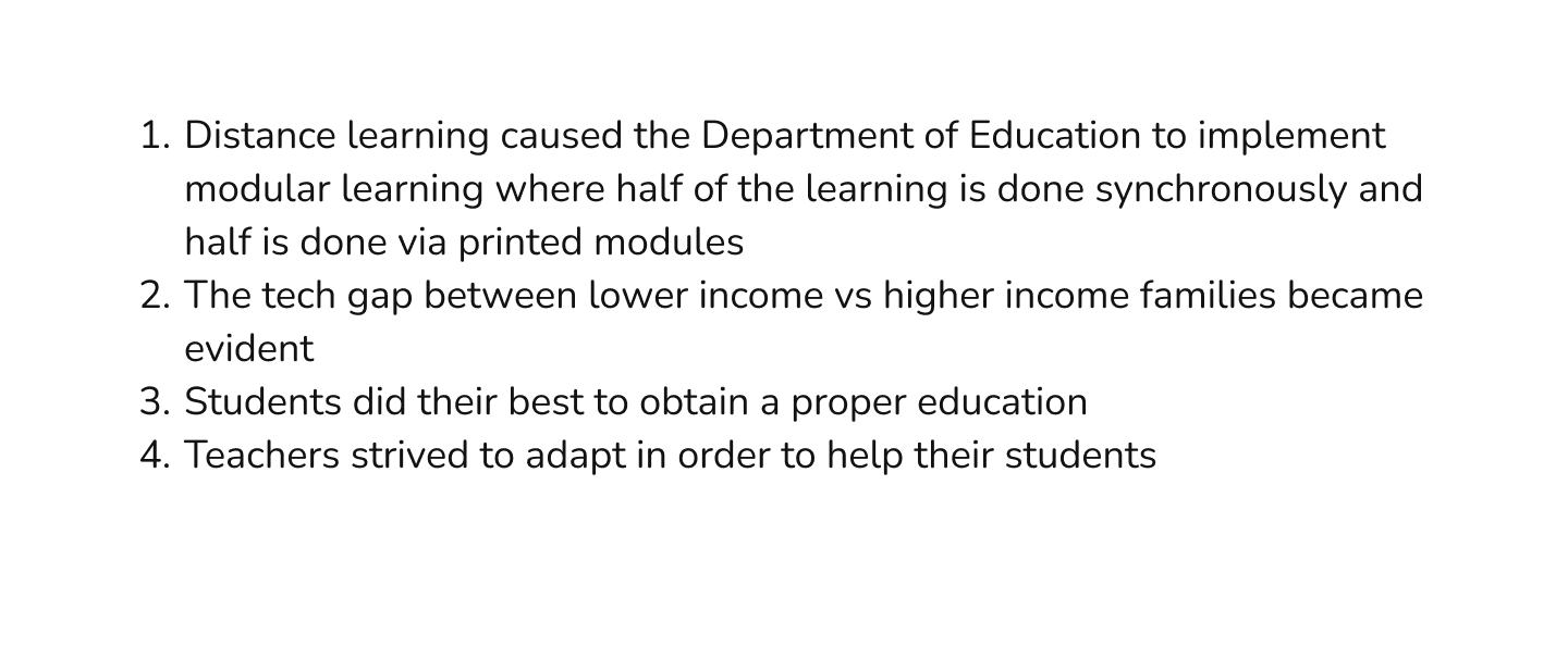
Upon exploring how education in Philippine public schools changed once distance learning was implemented, I learned a few things:
Interviews
I conducted interviews on 2 students and 2 teachers. This was prior to identifying my primary persona. I wanted to ensure I had enough information from each user.
I drafted a few questions (in Tagalog - the primary language in the Philippines) to guide me in my interviews and if anything interesting or new had popped up, I would ask follow-up questions.
After being able to conduct interviews on public school teachers and students about their daily tasks in order to gain a better understanding of what could be improved.
This allowed me to identify pain points, leading me to create personas and identify user needs.
After being able to conduct interviews on public school teachers and students about their daily tasks in order to gain a better understanding of what could be improved.
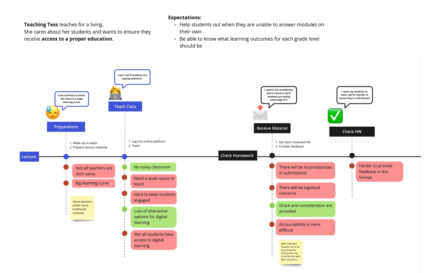
For students, I highlighted their experiences of lectures and homework.
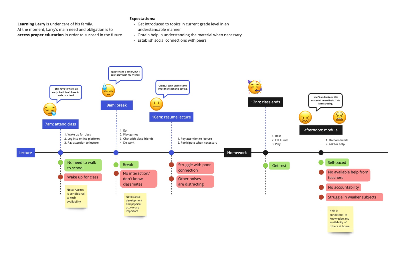
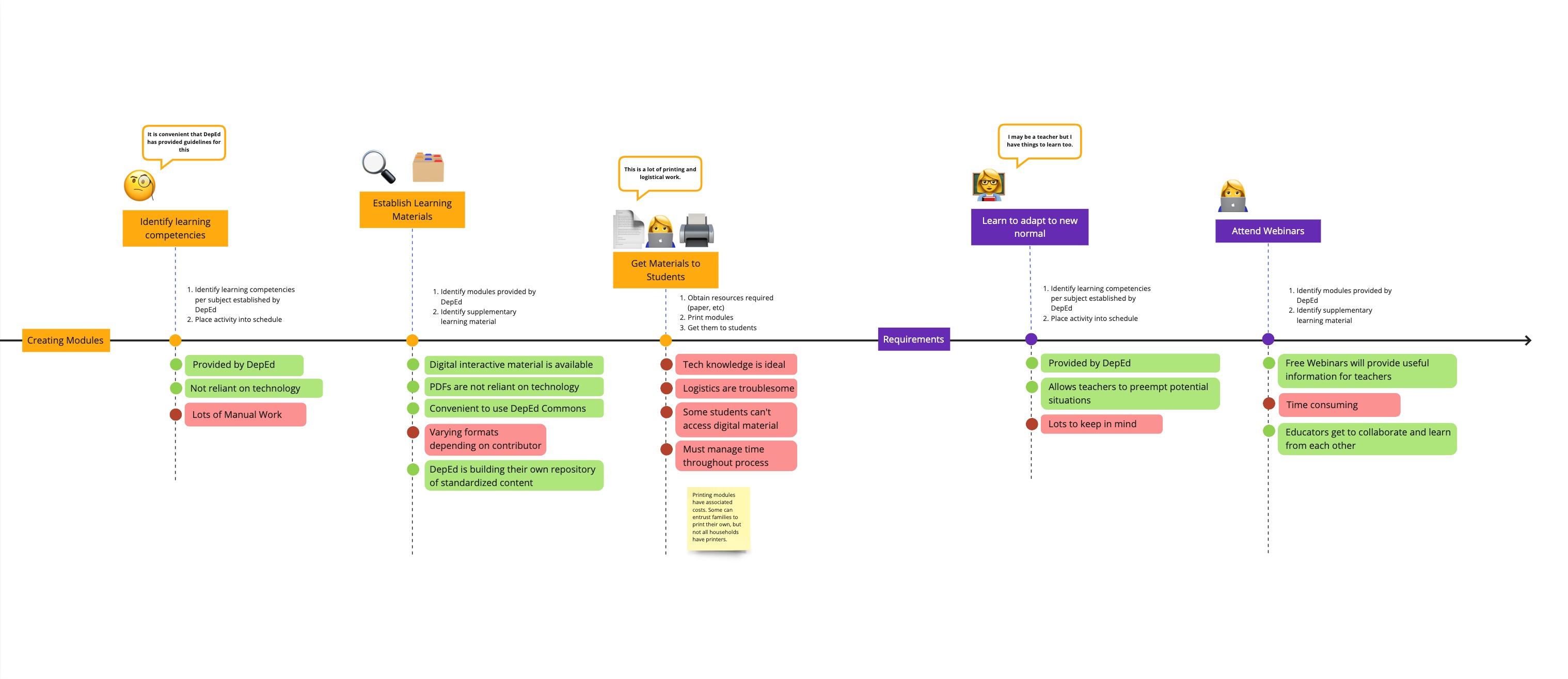
For teachers, apart from lectures and checking homework I also included their process for module creation as well as requirements teachers must undergo in transitioning to online learning and in improving their teaching methods. The latter was something I did not expect, but had discovered when I conducted my secondary research.
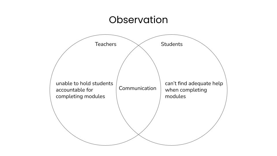
The students I had interviewed mentioned that on of their main pain points was that they had trouble completing modules on their own.
On the other hand, teachers mentioned that though they are able to communicate with students, they still cannot seem to hold students accountable for completing modules.
This led me to notice that there was a gap in terms of communication between students and teachers.
Beyond interviews, I also conducted secondary research to gain better insight to the processes of a wider range of users.
Personas
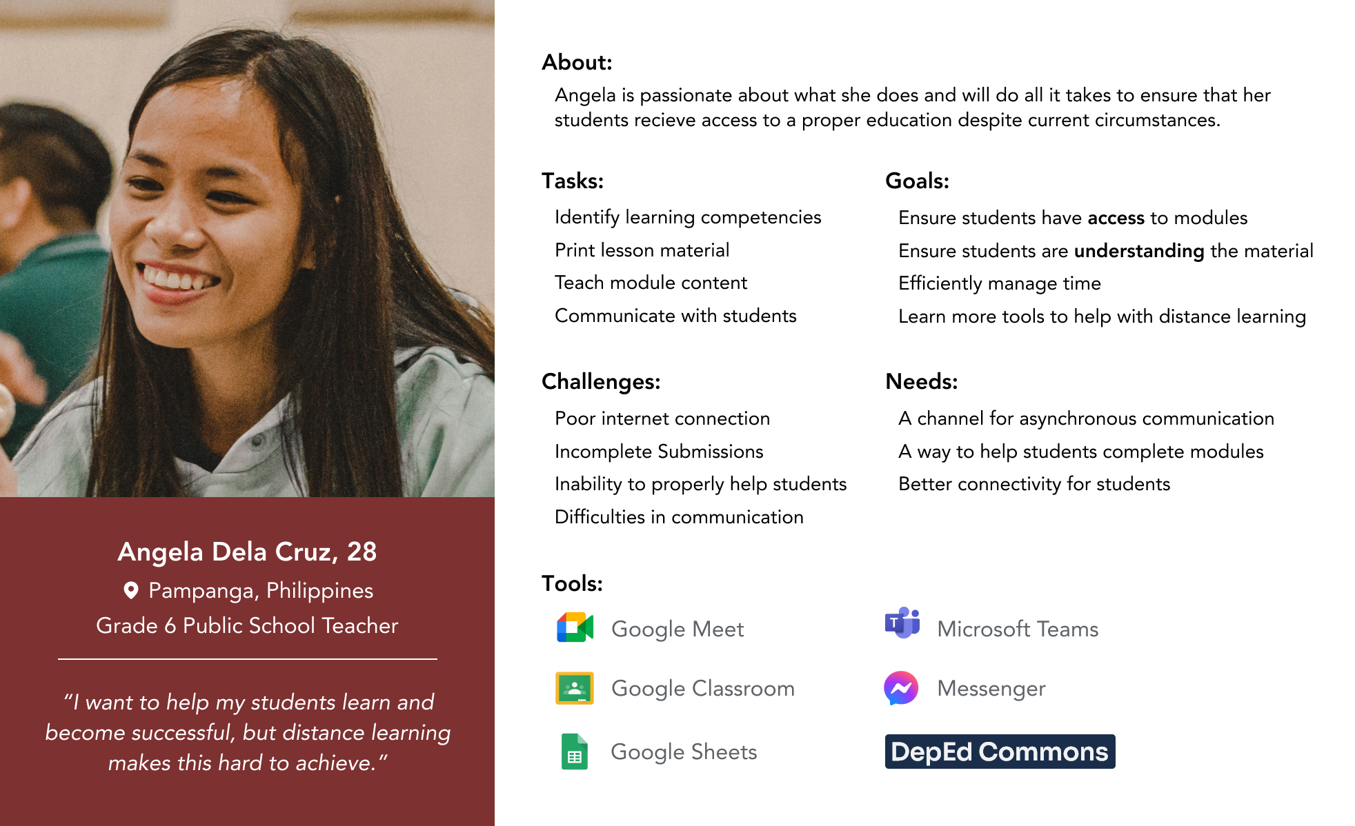
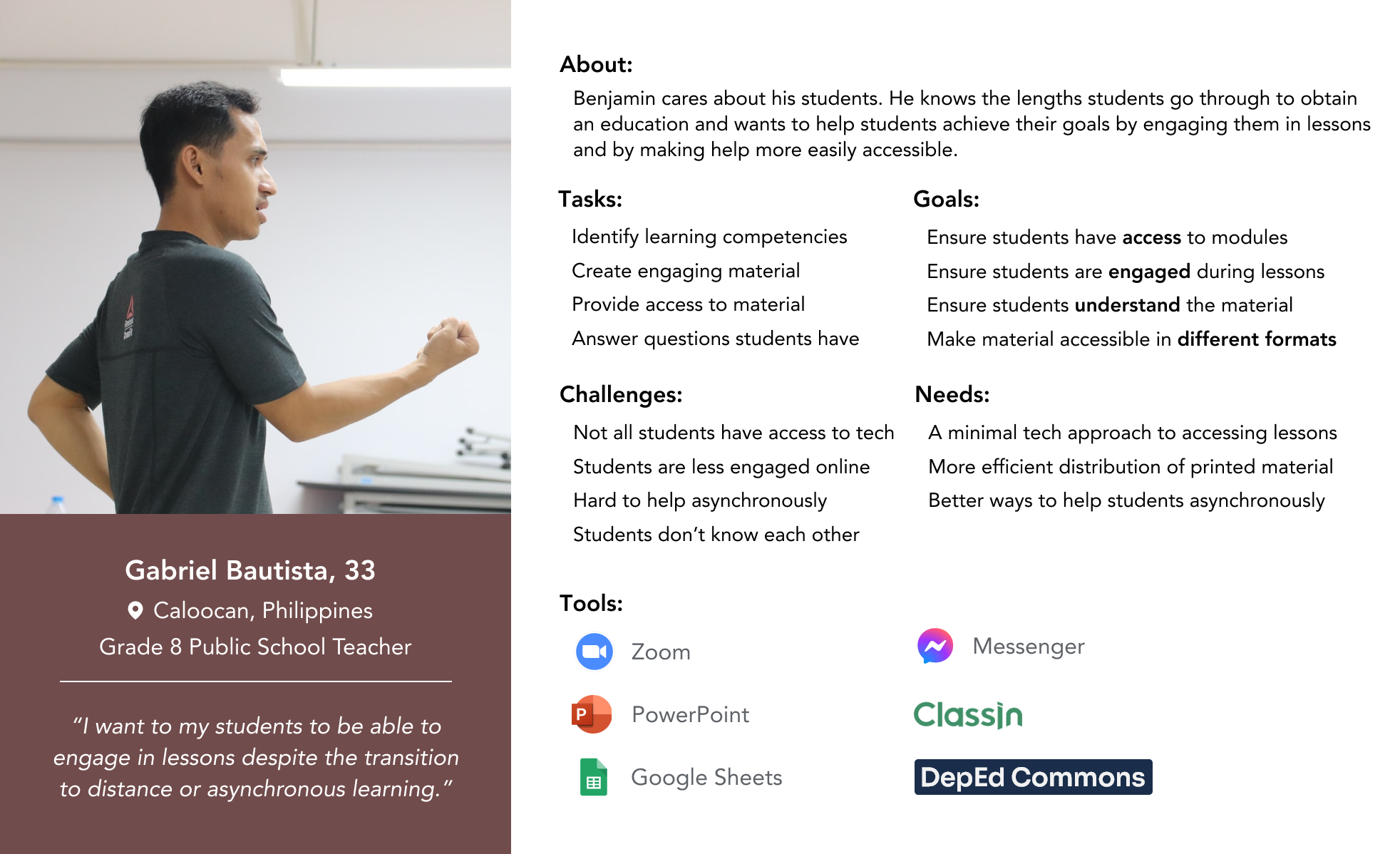
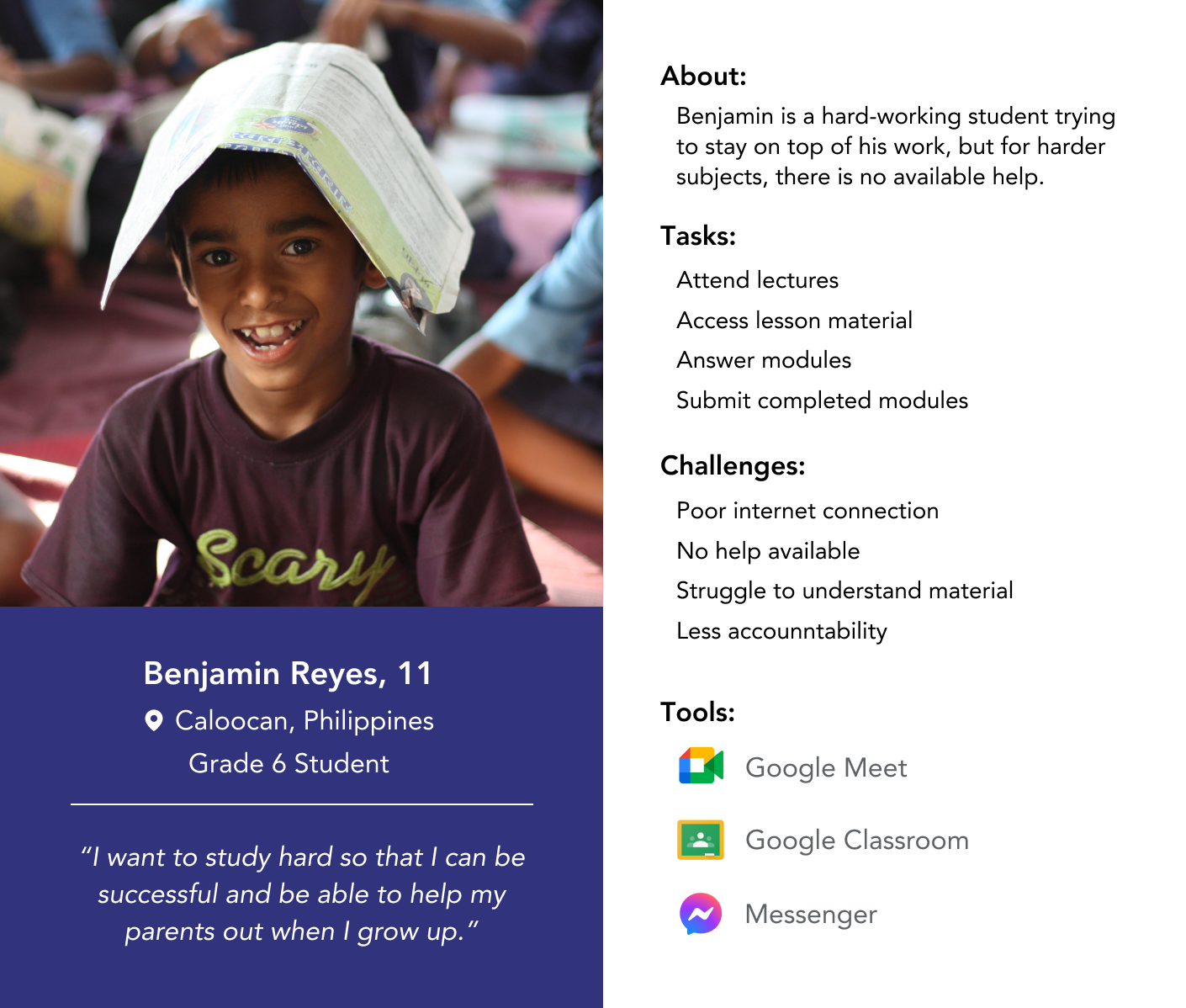
From the same interviews, I was able to create personas in order to better represent who I was designing for and establish greater empathy for the users.
Having 2 different types of users, I created a primary persona (teachers) and a secondary persona (students).
Competitive Analysis
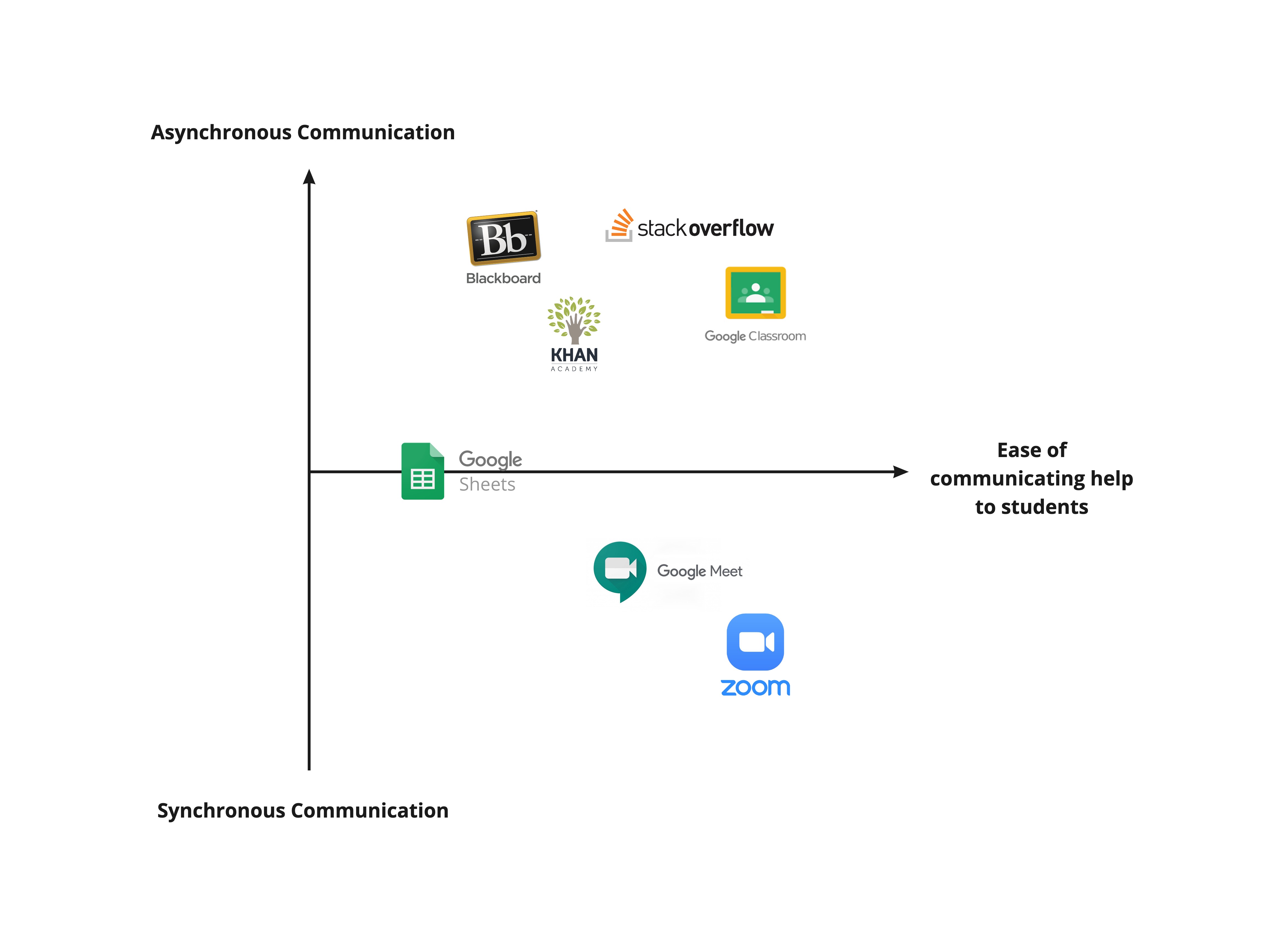
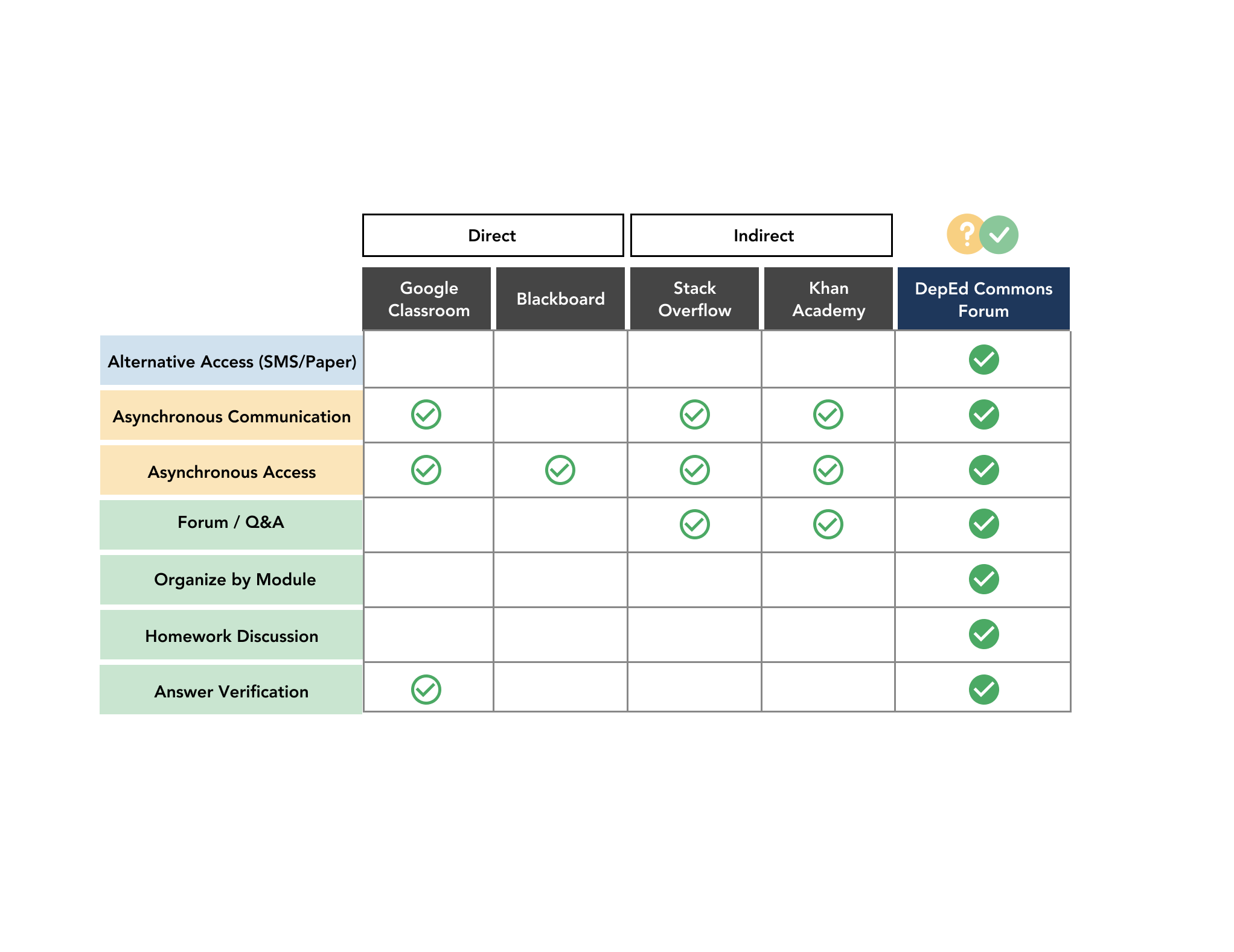
To help me gain a better understanding of the current environment and to inform my feature prioritization, I conducted competitive analysis of a range of platforms created to supplement learning. I mapped each out to deptermine the range of communication methods provided.
Then, I listed down features accoring to what was found upon identifying user needs and mapped which services provided which features. This helped me gather ideas on implementation, as well as identify gaps in current services that don't provide what my primary and secondary users need.
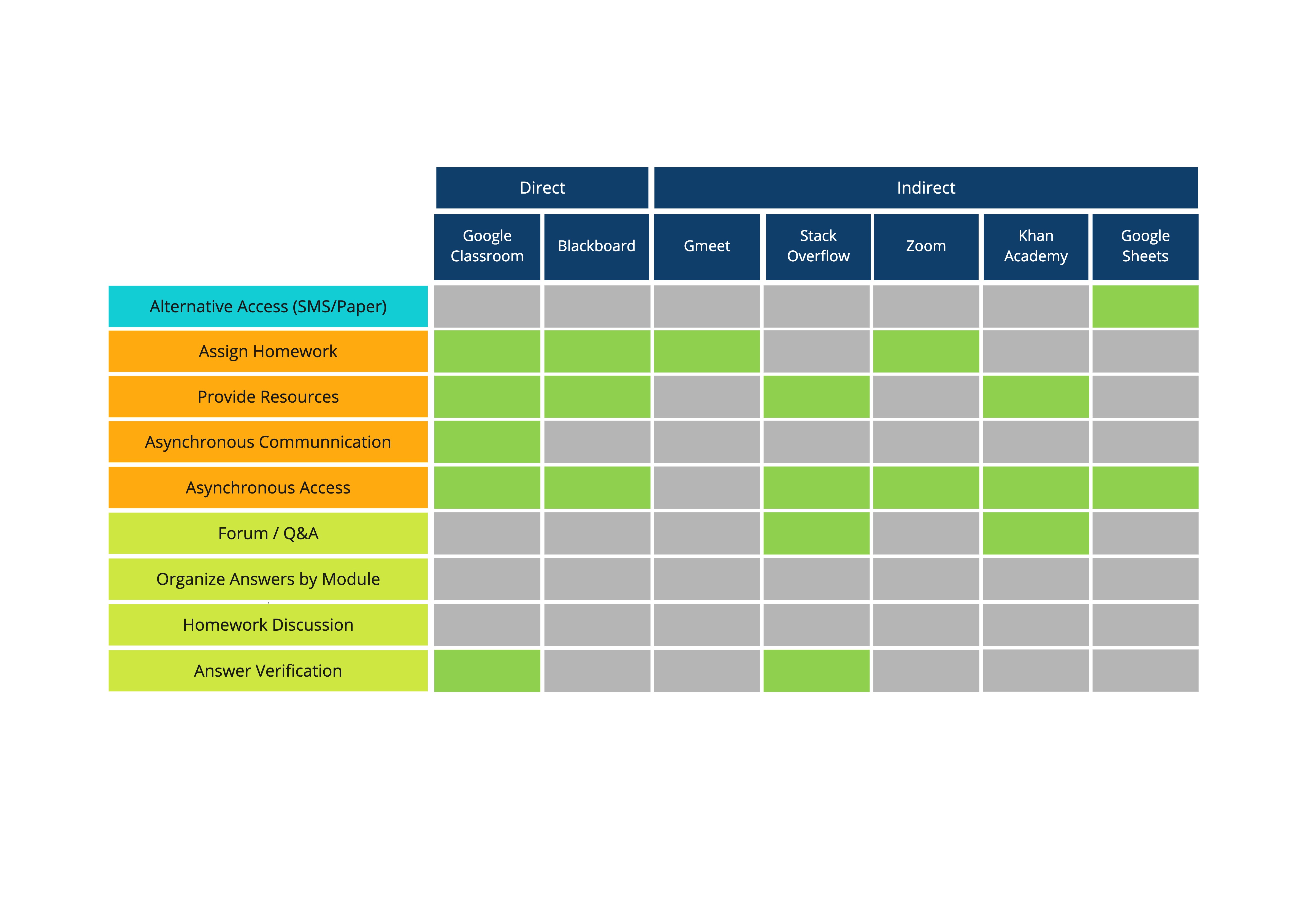
My ideal solution should then check most, if not all the boxes.
From this, I noticed that most fail to provide alternative methods of access (such as SMS or paper). Furthermore, since these are not tailored specifically for public school education in the Philippines, none of them take into account modular learning or a syllabus structure.
Feature Prioritization
I re-stated my problem statement according to the information my research provided:
"Public school teachers in the Philippines have trouble holding students accountable for completing modules while students have trouble seeking help. This can be resolved by creating an accessible channel for communicating and discussing questions about modules in order to facilitate distance learning."
Given that DepEd Commons is the current modular learning platform where students and teachers gain access to modules, I decided to tackle this problem by adding a forum feature for their site.
I first established the necessary features for the MVP.
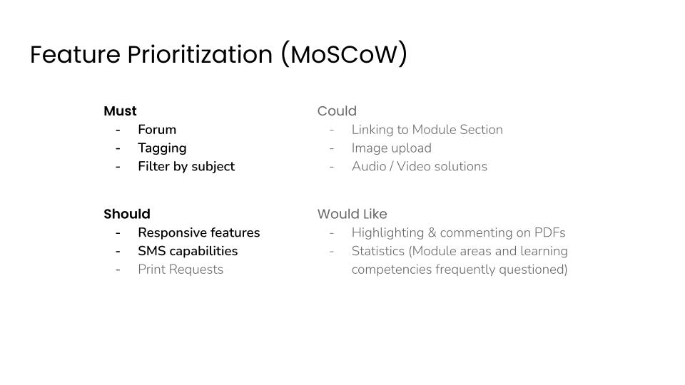
Combining the elements of my competitive analysis and feature prioritization allowed me to determine the service DepEd Commons Forum will provide.
I followed this up by creating user flows and sitemaps to establish the hierarchy of information that highlighte the elements necessary to achieve the MVP.
User Flows
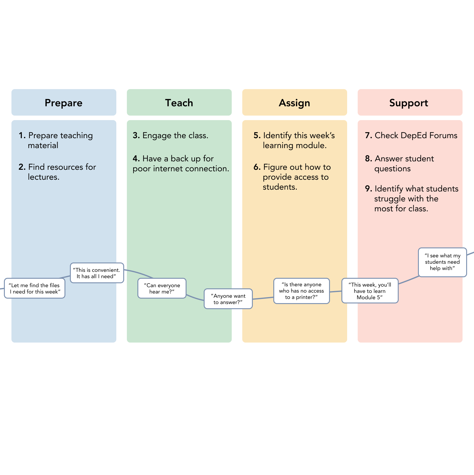
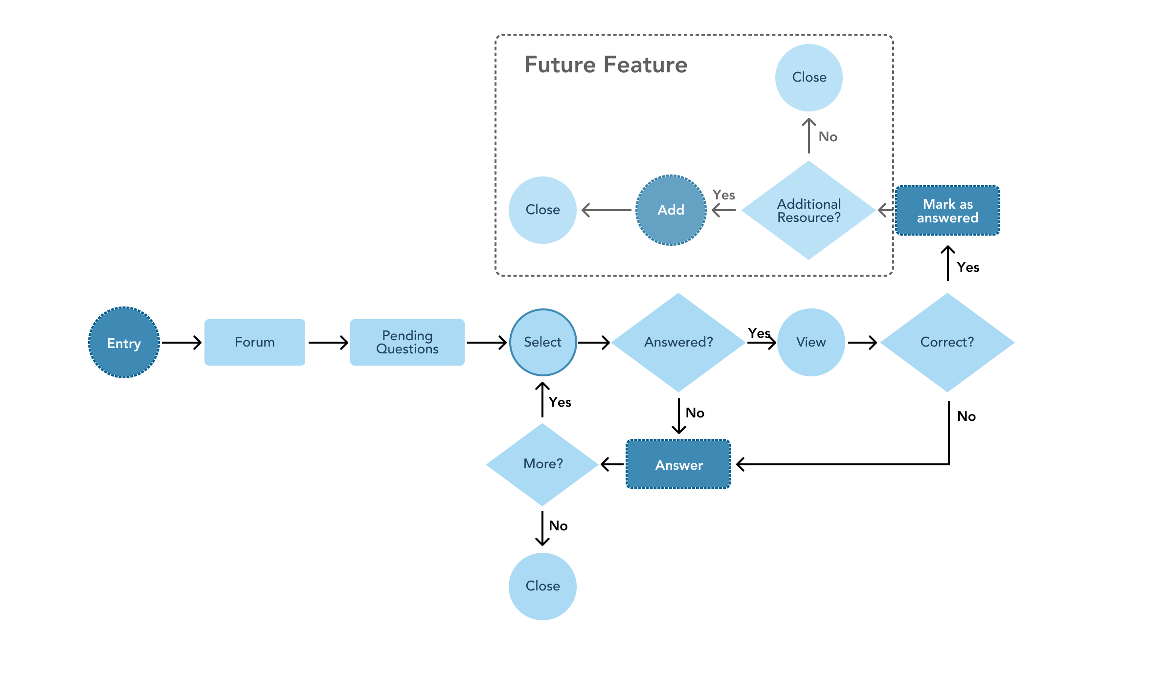
I wanted to focus on the user first in order to inform the experience. This led me to create a refined user journey prior to drafting my user flow.
To gain a better understanding of site navigation, I wrote down features and organized them and created high level user flows of other sites.
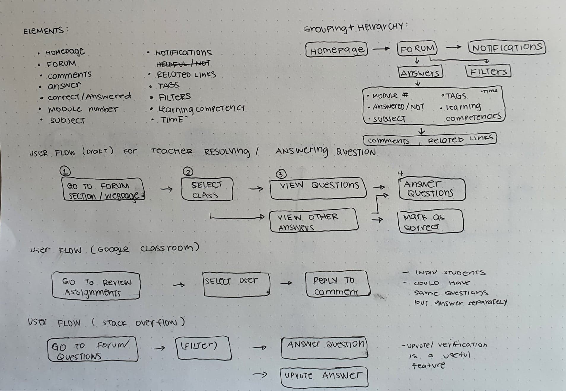
This helped me create a user flow for my MVP.
Information Architecture
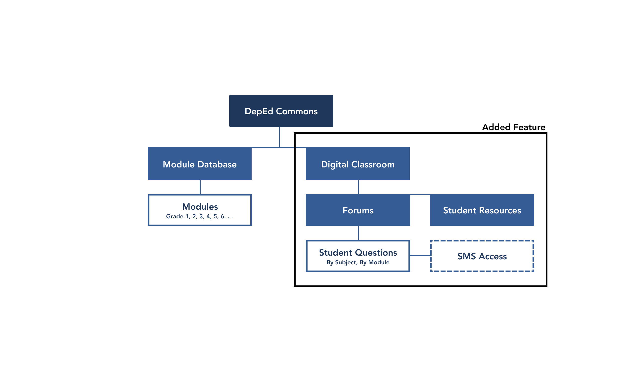
In order to visualize the heirarchy of features, I mapped out the site's ideal information architecture and highlighted important implementations for my MVP according to the feature prioritization I conducted.


Upon developing on brand and features needed, I was able to narrow down the features I was going to add to the image below.
Wireframes
Once I had a clearer idea of user needs and how the process would work, I drafted wireframes that included the must have features established earlier.
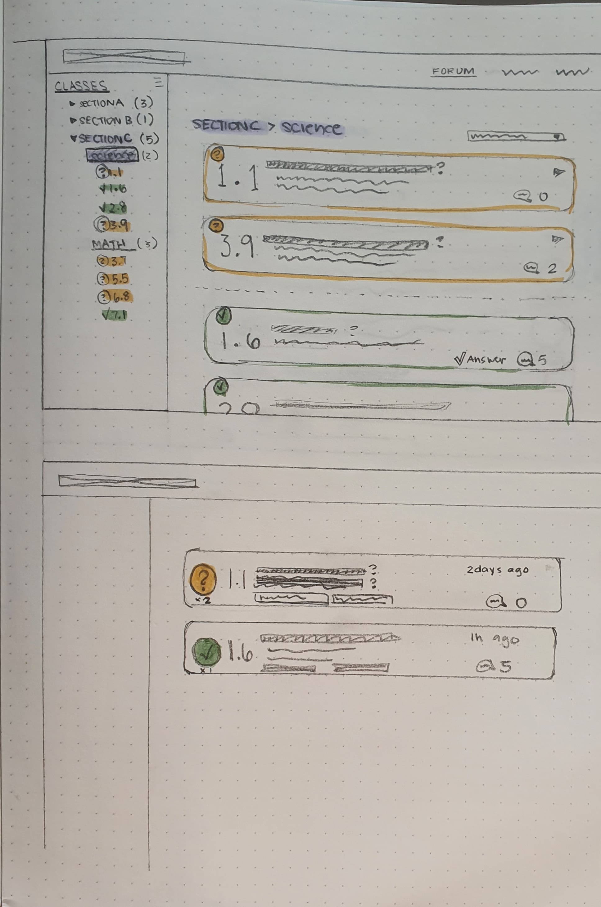
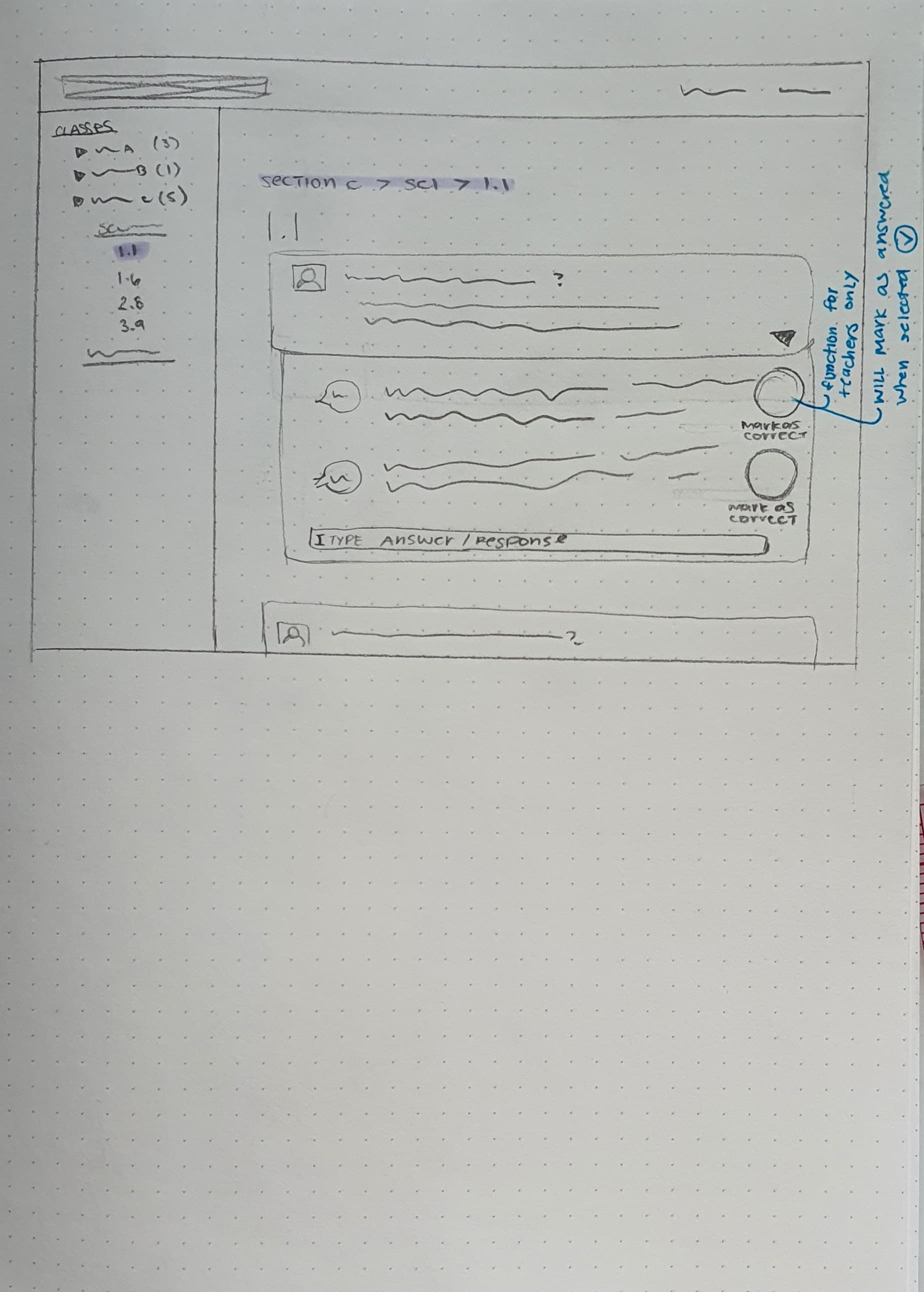
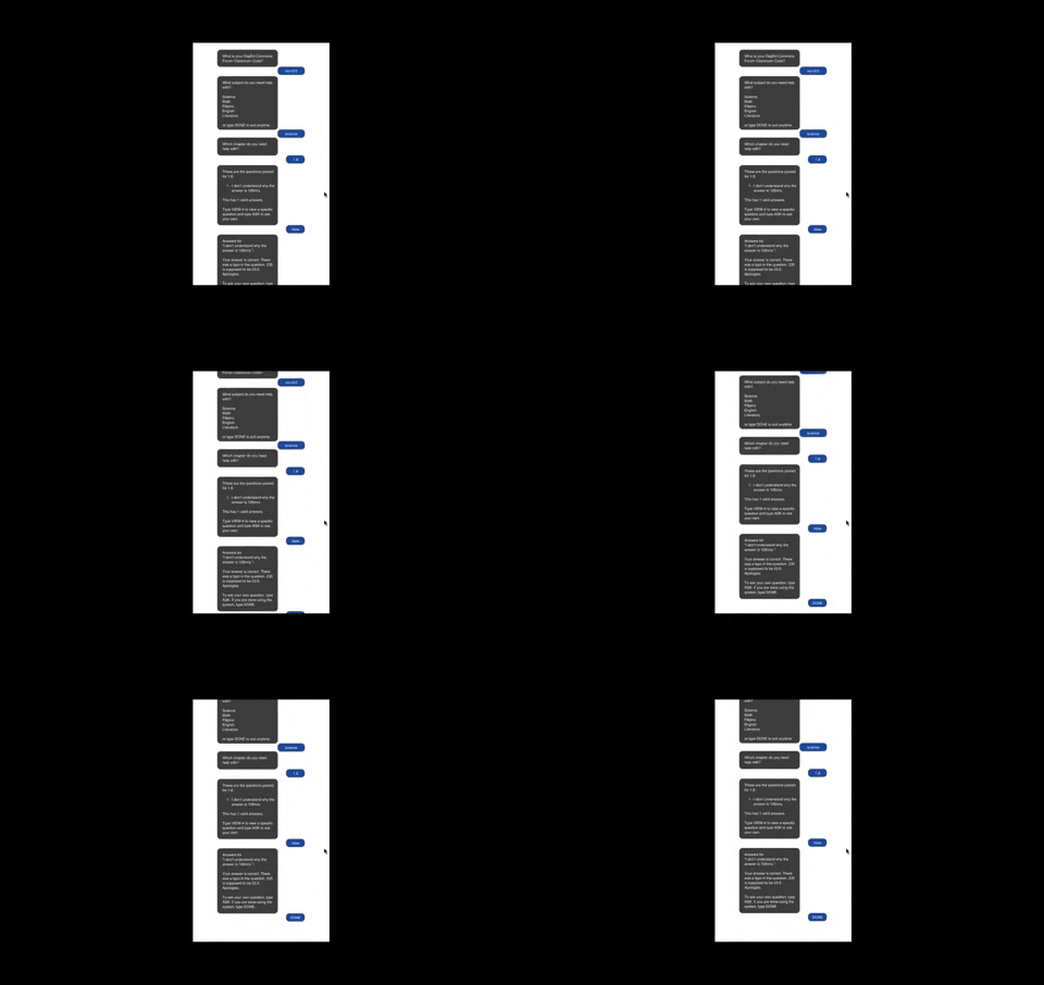
Given the lack of access many students have to the internet, I also considered improving access by including a wireframe for SMS interaction. This would ideally be implemented through SMS API for those with minimal access to technology or the internet.
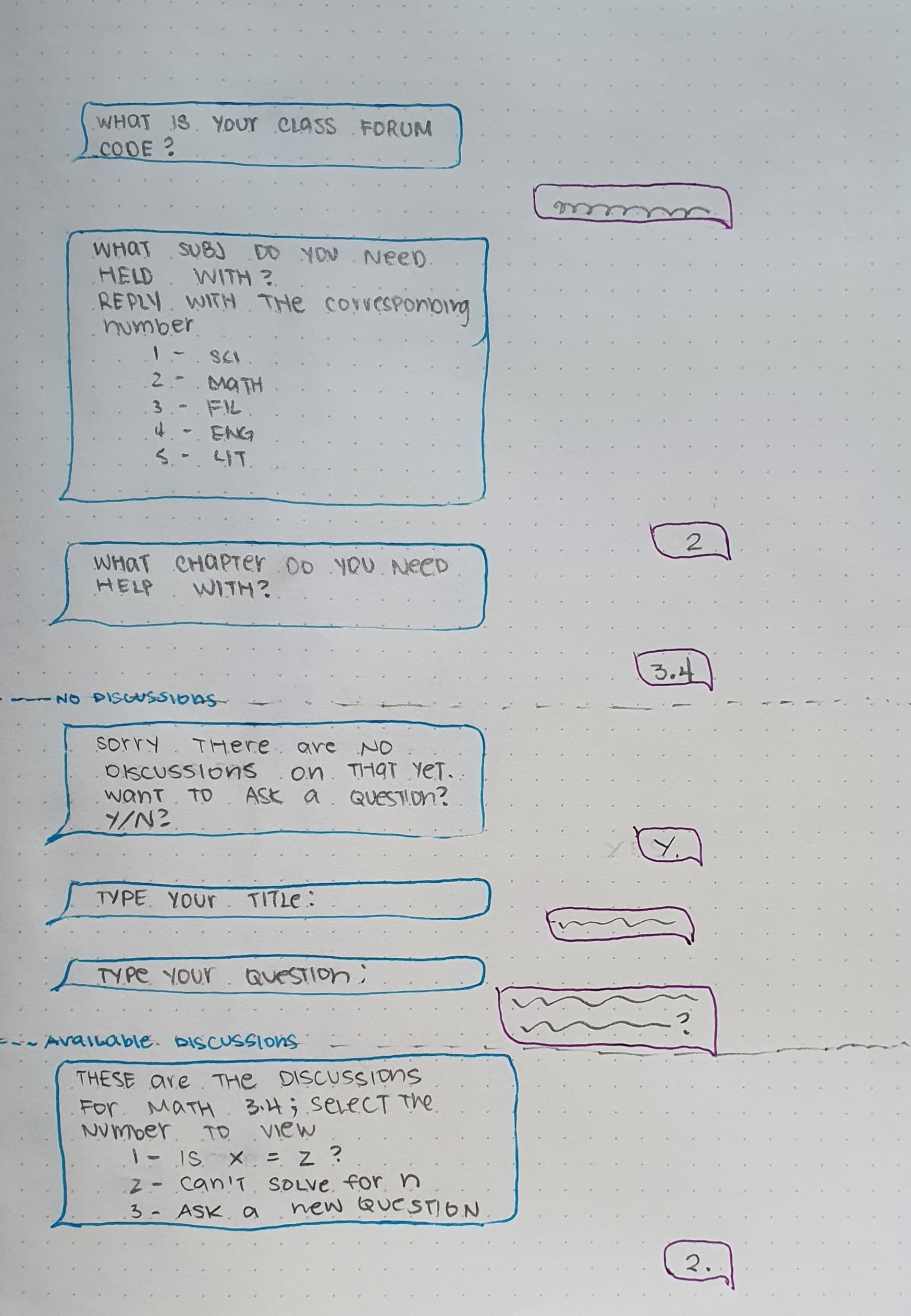
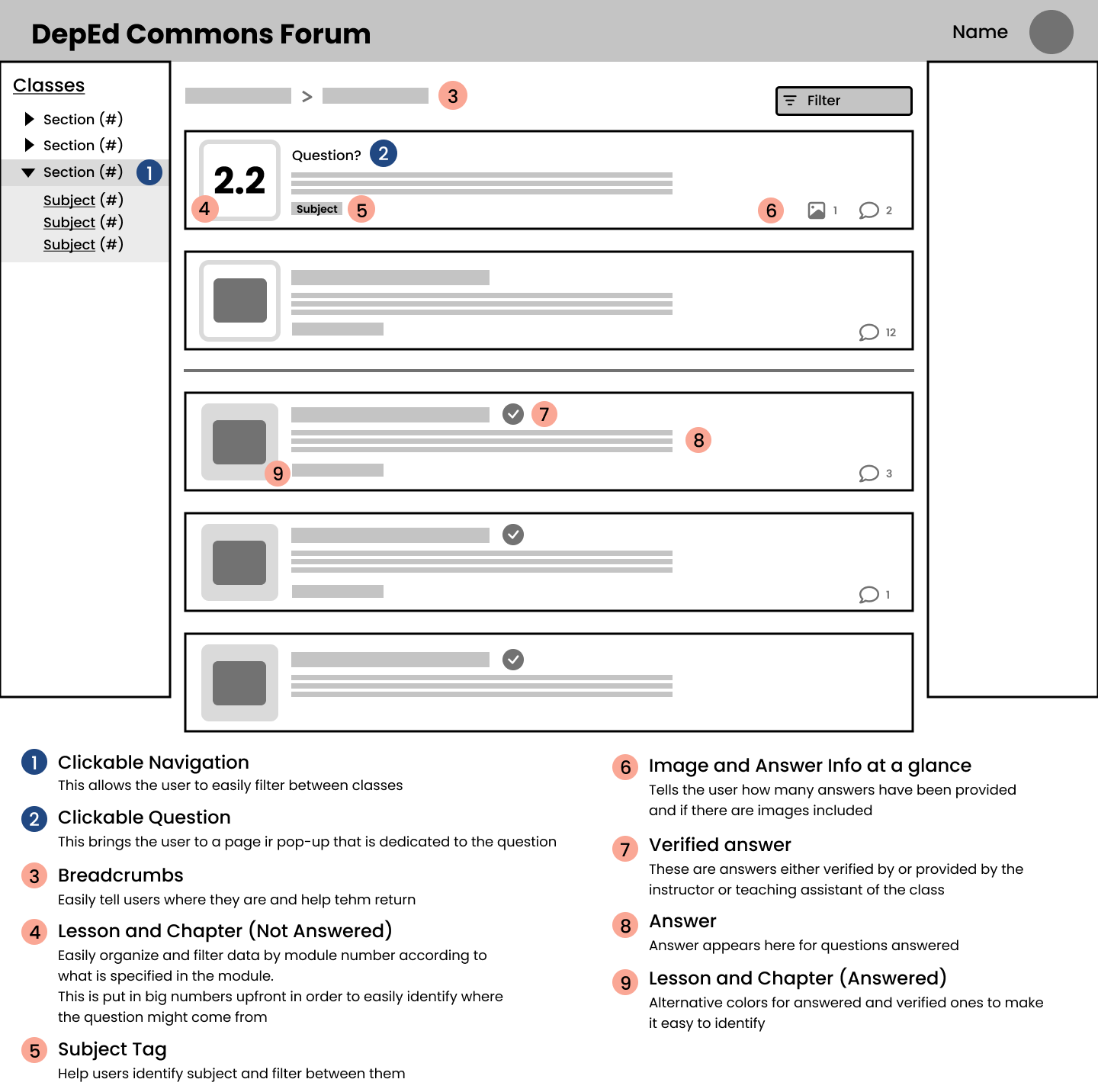
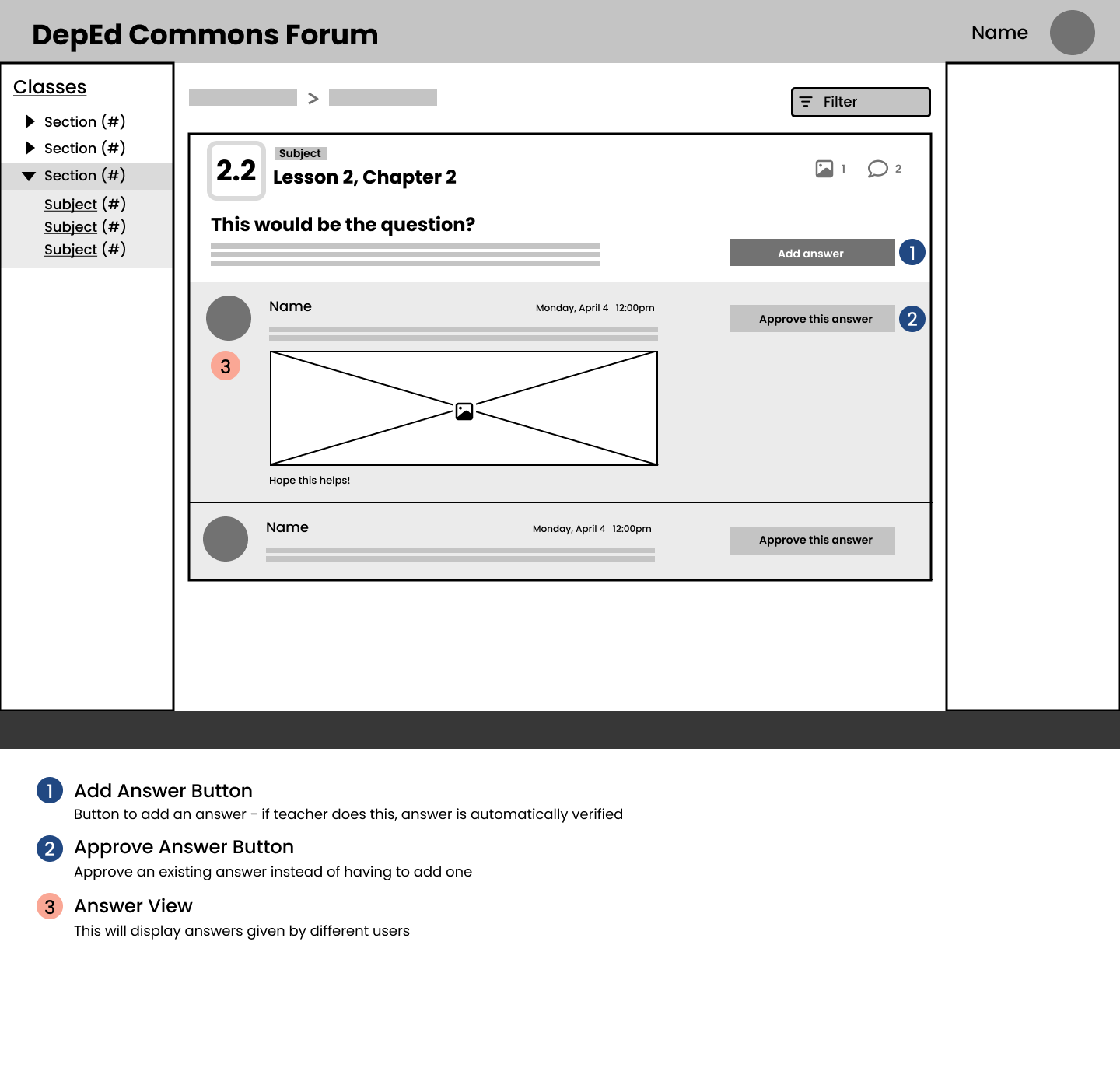
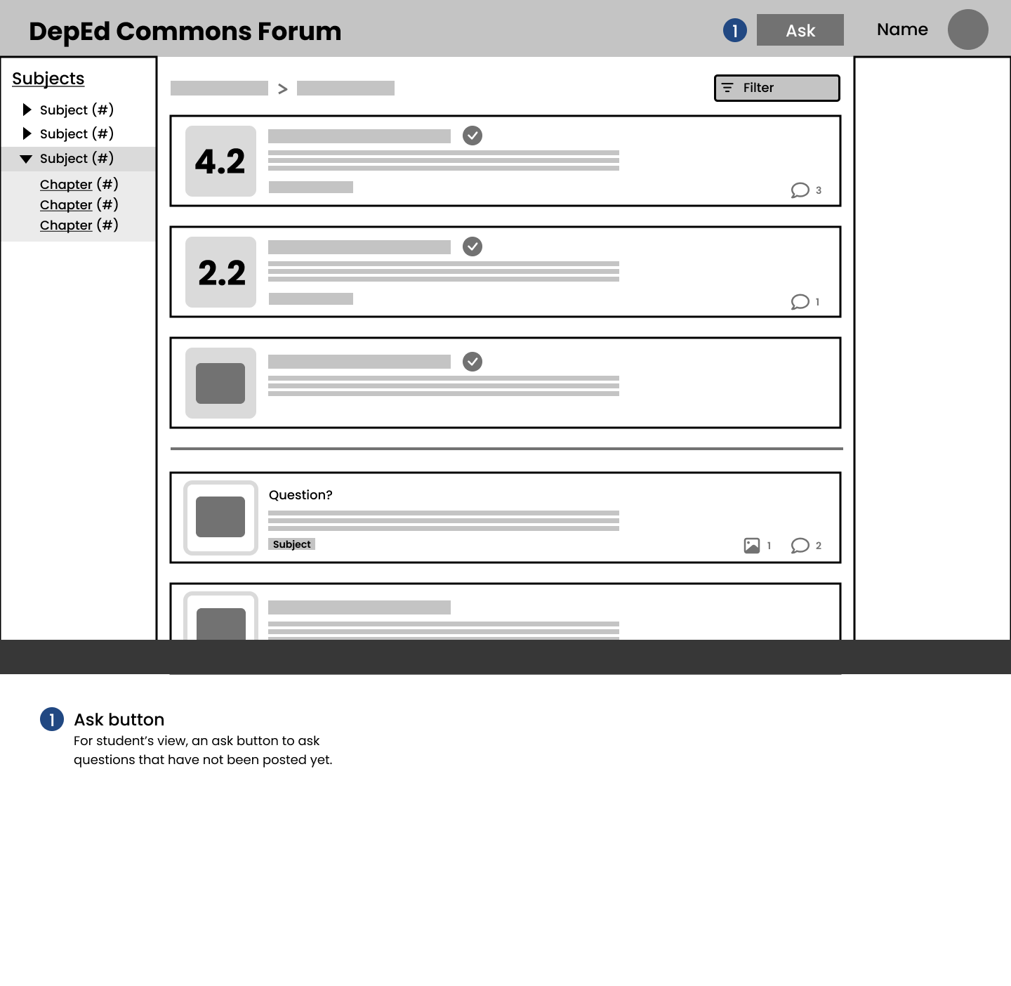
From my inital drafts, I was able to create more detailed annotated wirefreames that show the possible interactions and CTAs. The layout used utilizes the 12-column grid.
Design System
Prior to compiling and establishing the brand's visual identity, I began by laying out a foundation for the brand identity. This served as a guide in creating the visual elements.
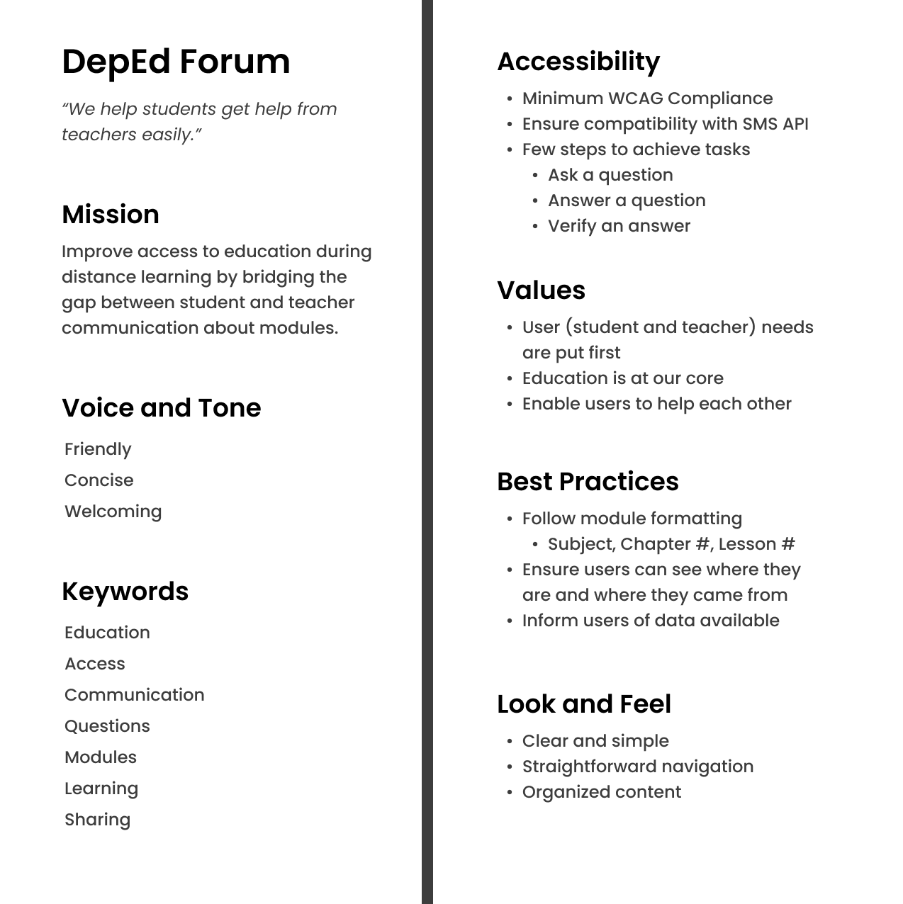
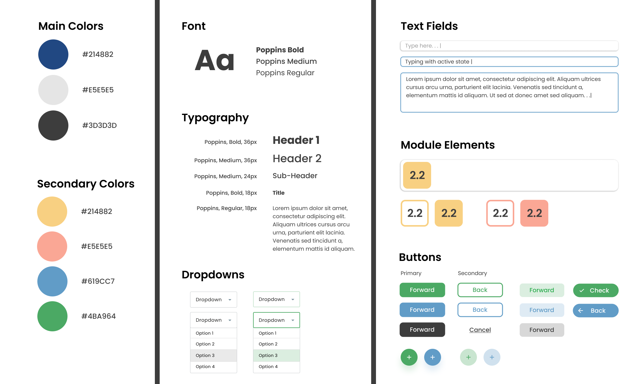
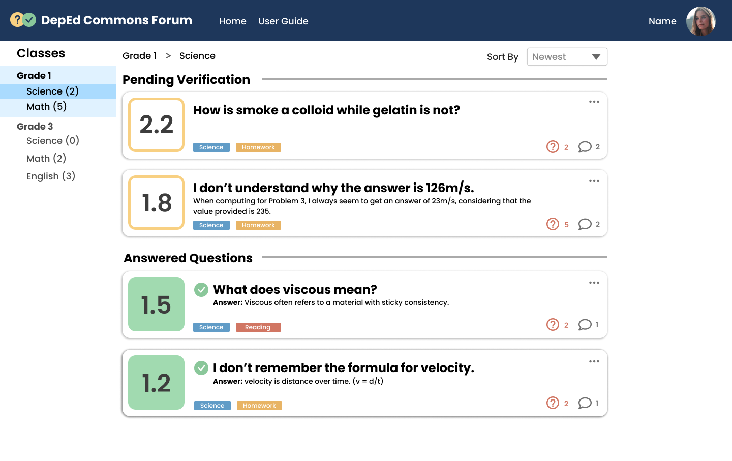
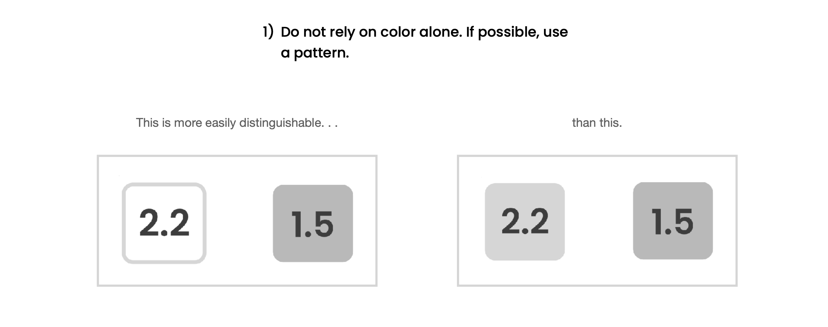
The visual identity of the site took after the visual identity of the DepEd Commons site at the time of the project. Other visual cues present in DepEd's learning modules, like the presentation of the module number, were also used in the web interface. This was to keep the branding consistent with the original.
Usability Tests
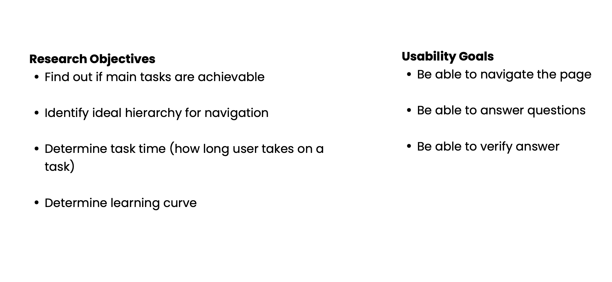
To prepare for testing, I outlined research objectives and usbility goals. I also created a usability script to guide me through testing users.
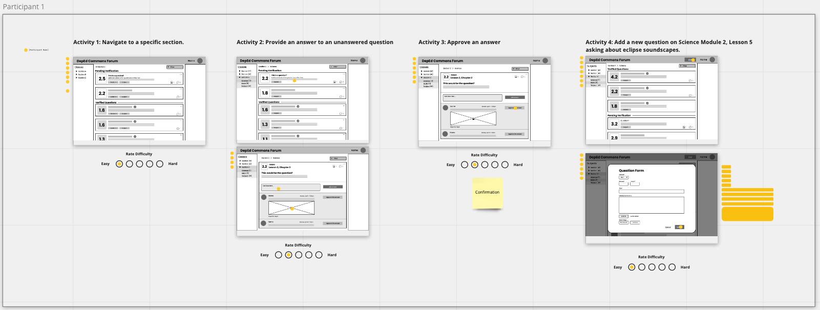
With the wireframes, I was able to conduct Usability Tests remotely (via screenshare and by experimentally using Miro).
I guided users through the screens and had them hover over or place stickers on where they would click to complete a task. Afterwards, I would have them rate the task and share more information about their experience.
High Fidelity
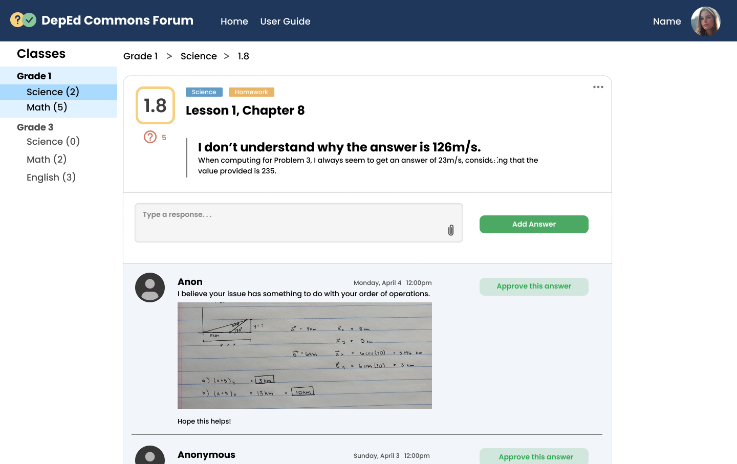
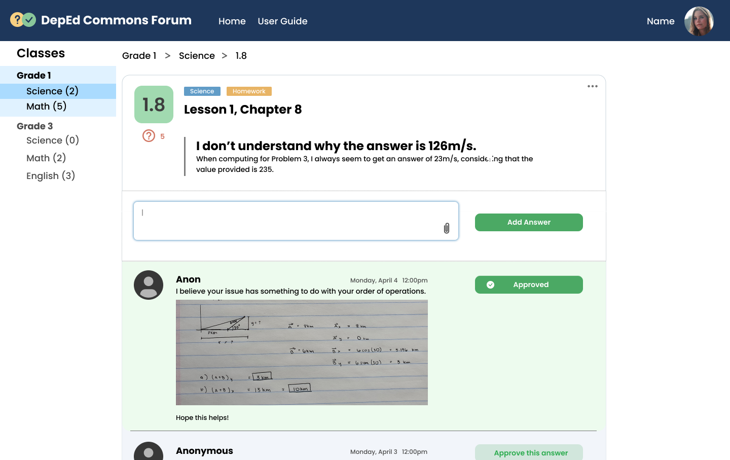
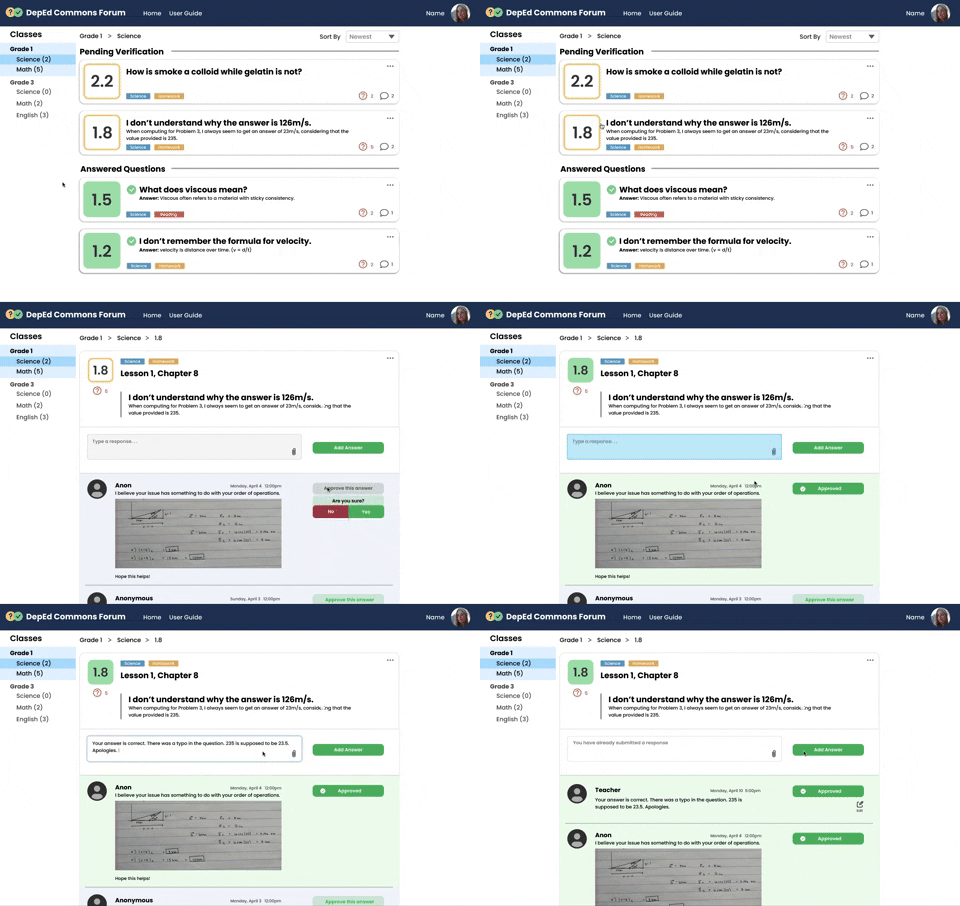
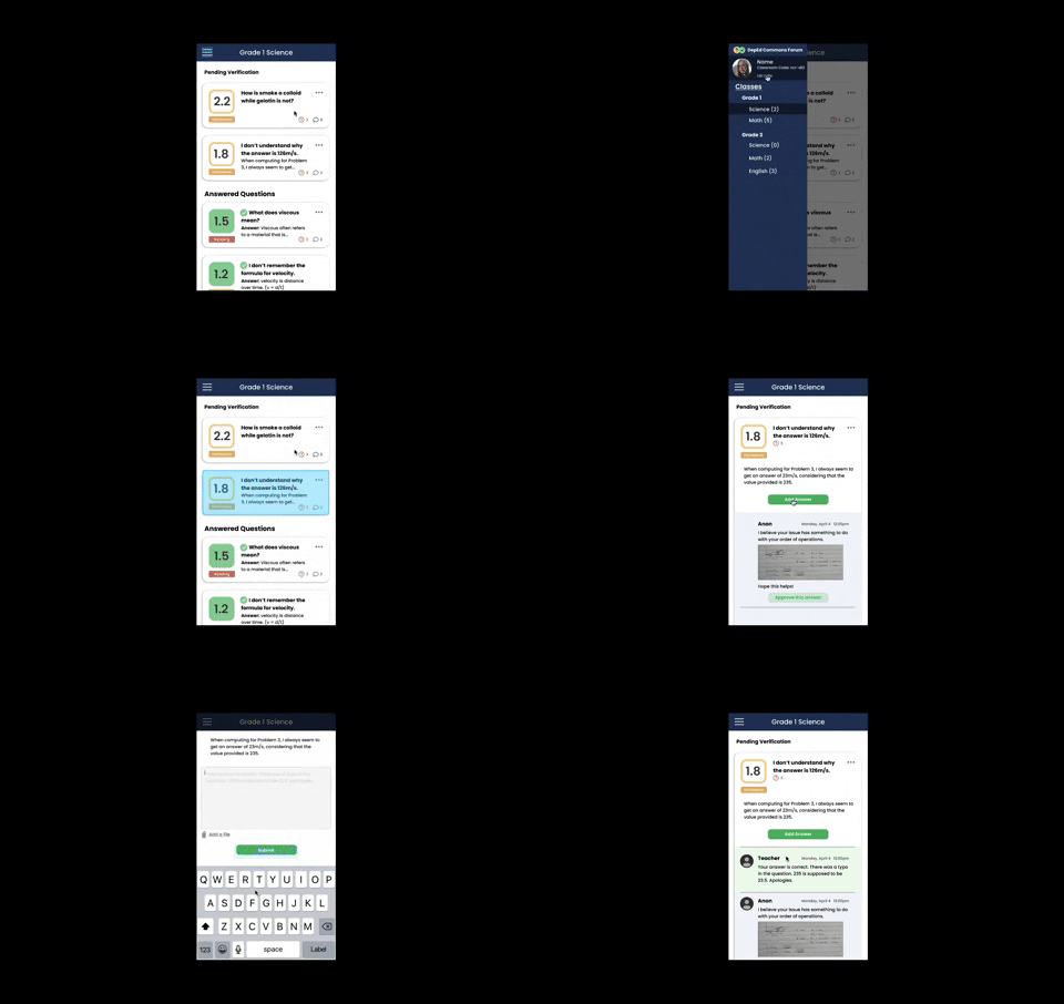
I applied my design system to my wireframes to produce high fidelity prototypes of the frames that were needed for the forum.
Lessons
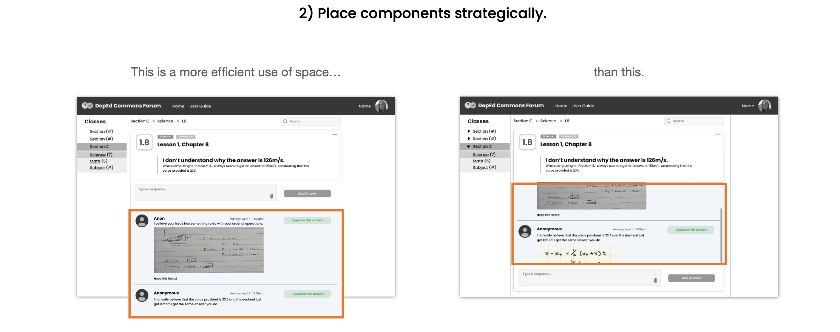
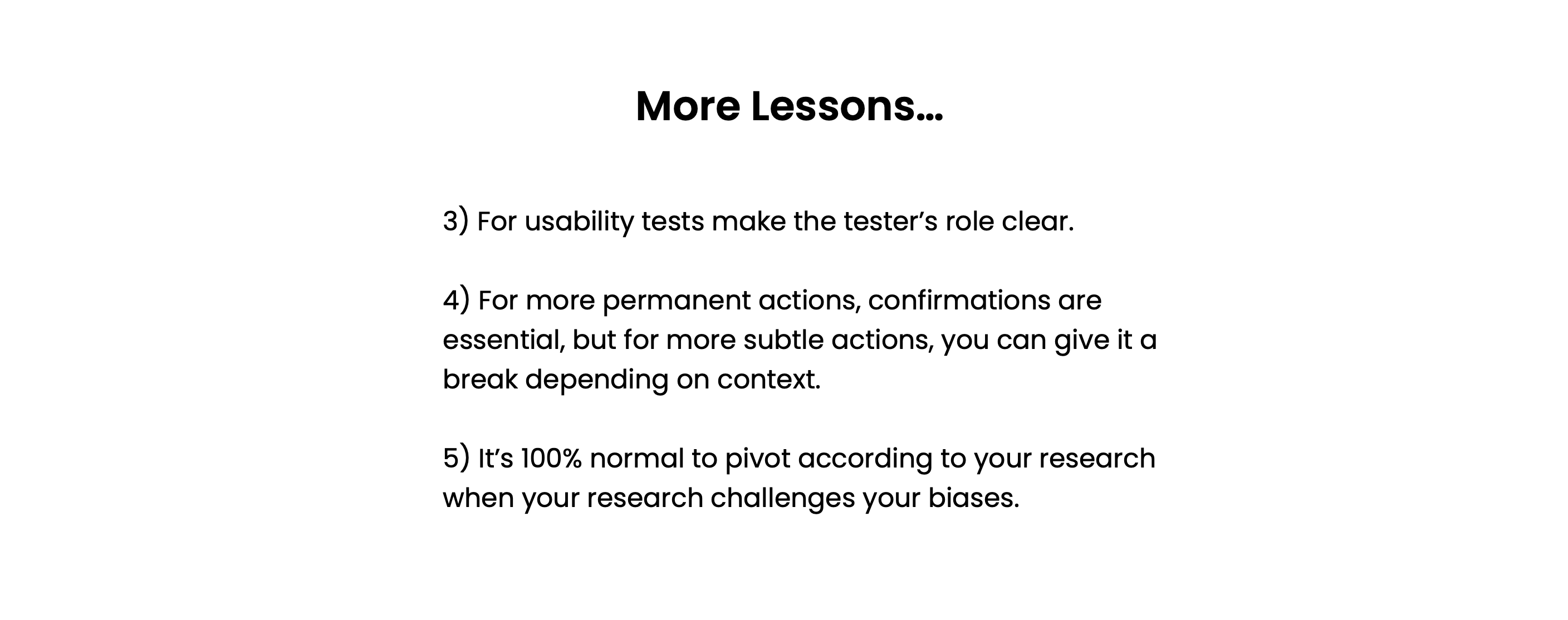
Future
In the future, it would be nice to be able to generalize this web app and make it usable beyond just modular learning. This would be something along the lines of being able to input syllabus content which would allow users to quickly view a week at-a-glance and open up discussions of the questions that pop up beyond lecture hours.
Prototypes
Browser Prototype:
Mobile Prototype:
SMS Prototype:
