Project: Eclipse Soundscapes
A UX Project to create a usable and accessible citizen science experience for the Eclipse Soundscapes: Citizen Science Project by ARISA Labs in partnership with NASA.
Tools used:
Miro, Figma, Slack, Google Suite
Process Outline:
Roles:
UX Research, UX/UI Design
Team members:
Tatyana Graesser, George Liu, Dana Sy-Ching
Project Brief
The project began with a brief on ARISA Labs' Eclipse Soundscape Project, where we gained familiarity about the stakeholders' vision, mission, goals, and progress for the project.Here, we learned about the structure of the Eclipse Soundscape Citizen Science Project as well as the current state of their website.
Given that the website was static and most of the pages were taken down, we were not able to identify or find a place on the website for citizen scientists to analyze and observe soundscape data and we were not able to gather much about the data analysis process of the eclipse soundscapes: citizen science project.
Stakeholder Interviews
With the many ways to proceed forward in improving their website user experience, we were unsure of how to proceed. Our team wondered about the next steps to take; whether it is creating an educational platform, creating a way for citizen scientists to intereact with data, or whether it is to revamp their webpage. While we were briefed about out stakeholders' goals, we were unsure about what our stakeholders wanted to prioritize.
Instead of speculating further, we decided to conduct an interview with out client, identifying their next steps, current needs, and priorities. From this, we identified their 3 "must-haves" to include:
- The ability to search for eclipse soundscape data by date, time, and location.
- Analyze eclipsee soundscape data by allowing users to experience how some parameters over time.
- FAQs relevant to searching and analyzing data
With this information our team proceeded to:
- Conduct research on the structure of citizen science projects and common tools made availabe for citizen scientists.
- Gather data on potential users, specifically their reception to information spiels about eclipse soundscapes, as well as their interest in participating.
- Identify data relevant to soundscapes along with the best ways to present this data within the site.
Primary Research
Our team gathered responses from 11 people and followed up with 3 people to gather insights on eclipse soundscape knowledge and interest. 90.9% of our respondents had seen an eclipse but 100% of them had no knowledge of eclipse soundscapes.
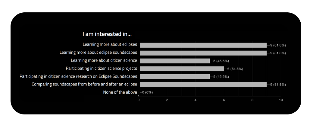
Additionally, 100% of our respondents had no prior knowlegde of Eclipse Soundscapes and Citizen Science Projects, but after providing basic definitions of each, they were easily able to grasp th concepts and gain interest.
Secondary Research
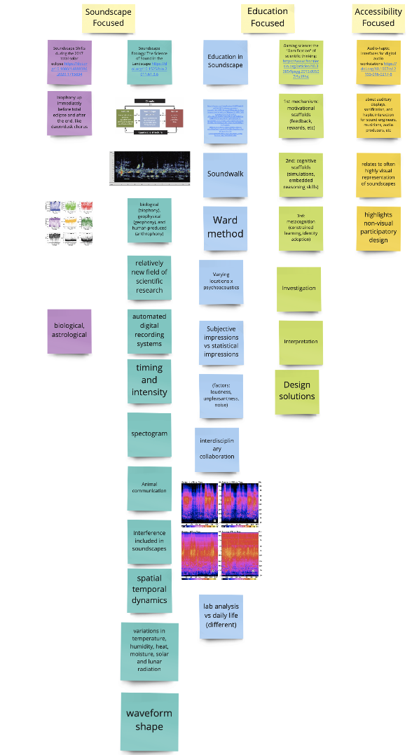
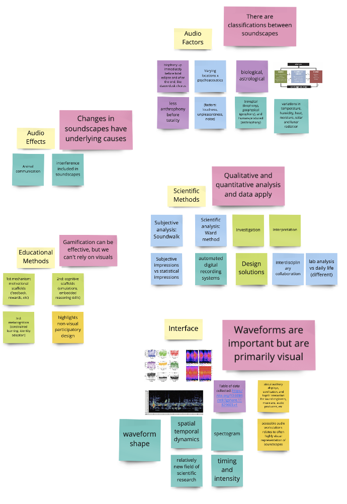
- We looked into Arbimon to learn more about soundscape data, mapped all the variables and identified the most relevant ones based on amount of data present in each category. (more on this in Information Architecture)
- We looked at other citizen science projects and utilized usability testing to identify features that could be useful for the current goals of the eclipse soundscape citizen scieence project.
- We took reesearch notes on eclipse soundscapees while considering the educational and accessibility factors that may be relevant to the project.
- From these notes, we utilized affinity mapping to gather our 5 key insights:.
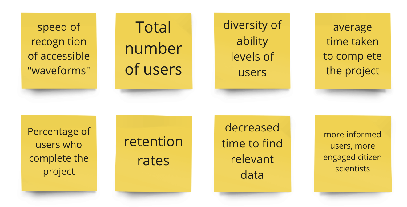
- Finally, we identified KPIs based on the data we found and our stakeholders' "must-haves"
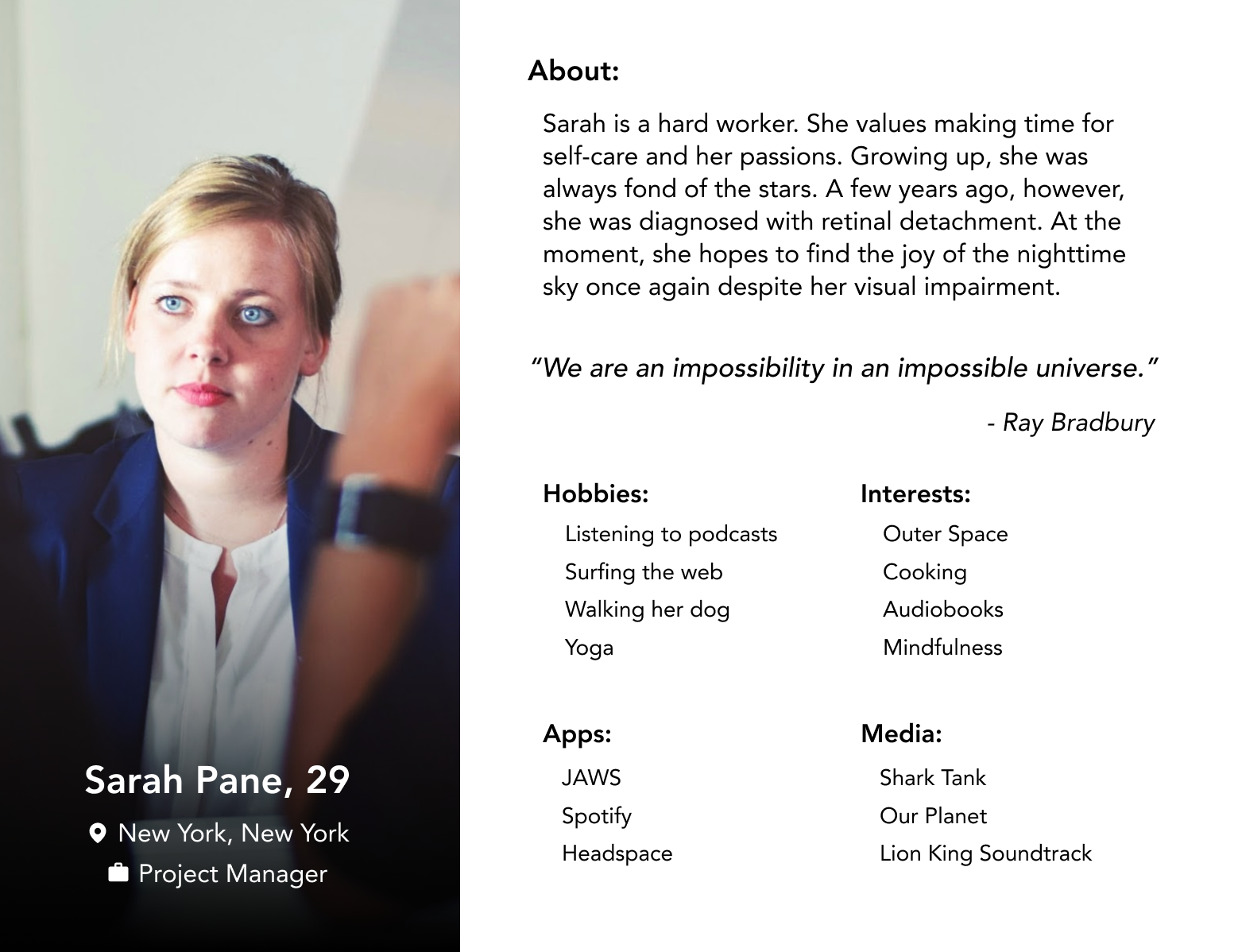
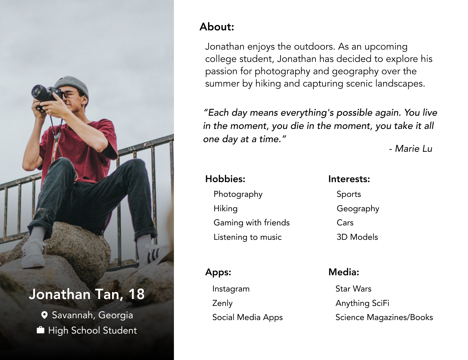
Personas
From our respondents and accessibility standards, we created 2 user personas for potential users.
We ensured that our two user personas had varying interests, abilities, and lifestyles since citizen science projects are open to all. This means there is a wide range of participants. Representing this in our personas allowed us to design better for all.
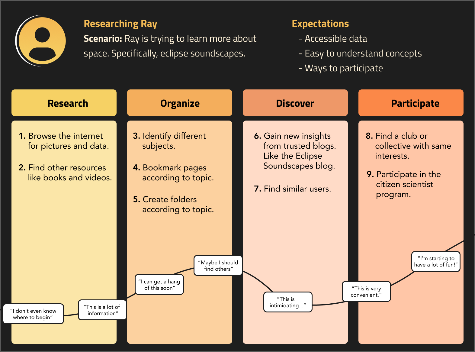
User Flows
From the information our stakeholder provided about the process of involvement in thee eclipse soundscape citizen science project, and the information from our respondents, we were able to create a user journey that shows the ideal process of participating in the project.
Information Architecture
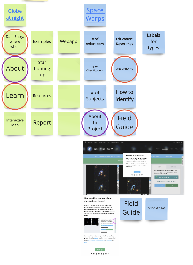
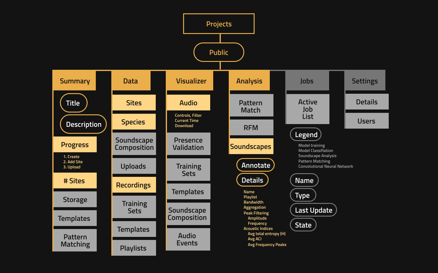
We created a sitemap of the state of the current webage at the time to gain a better understanding of the areas of improvement.
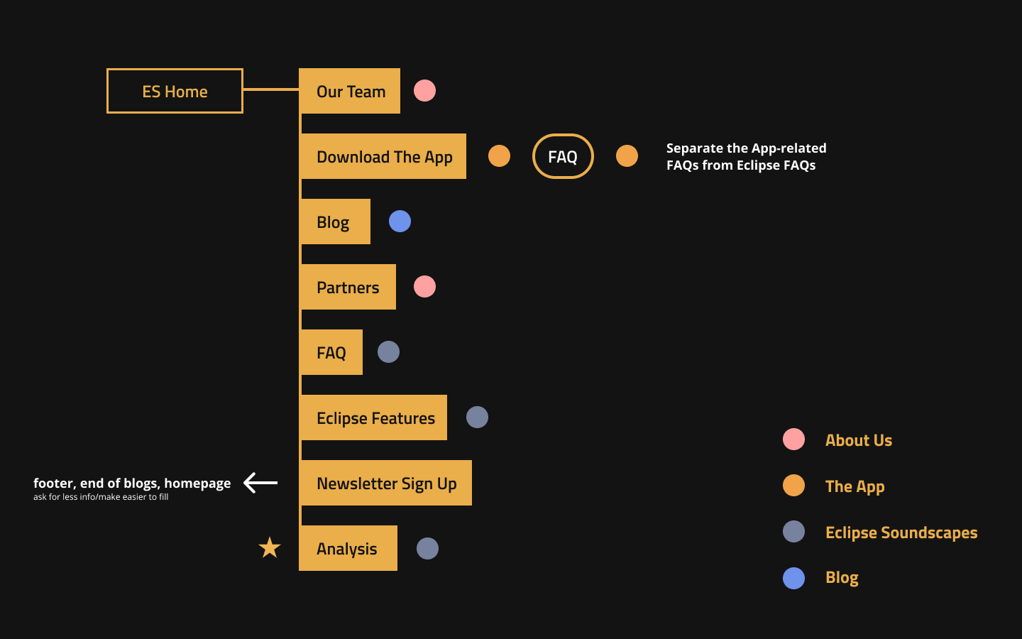
This allowed us to organize the website by topic to create heirarchy. The colored dots above show the different groups we organized the pages by.
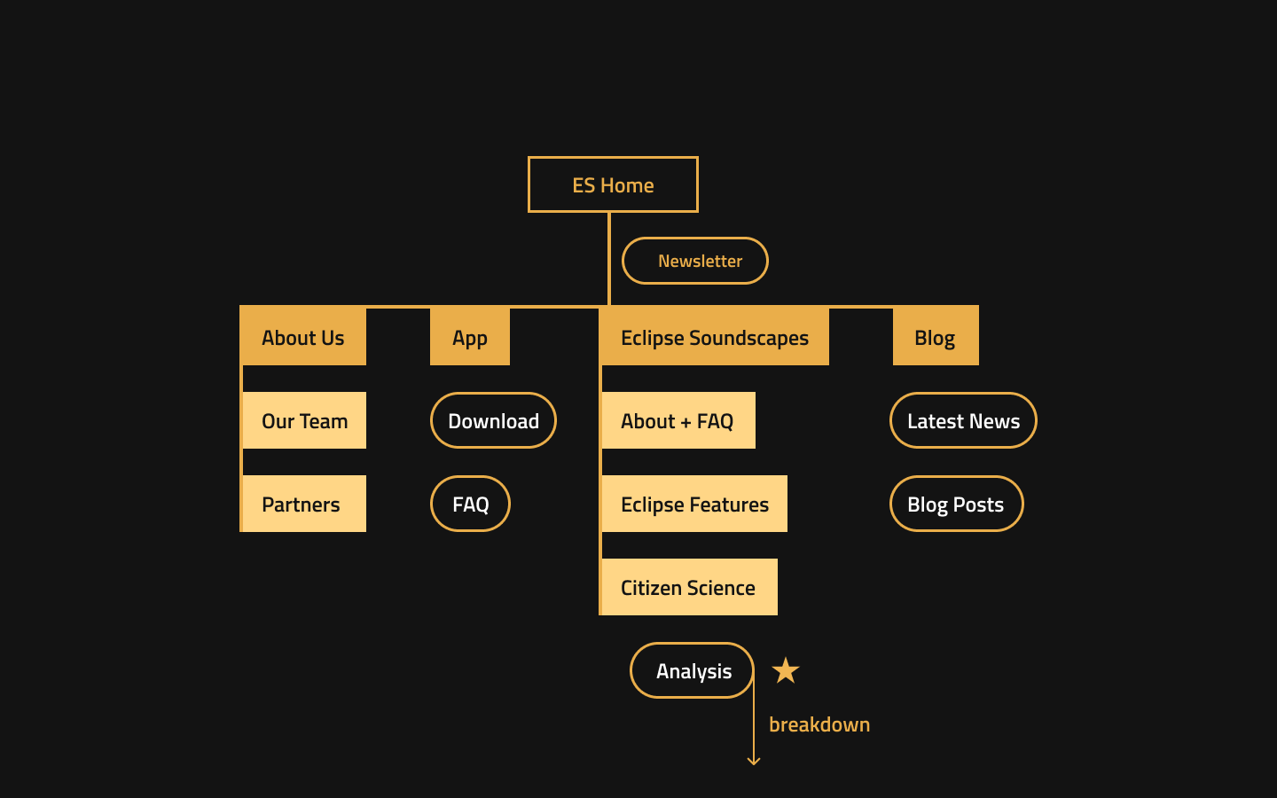
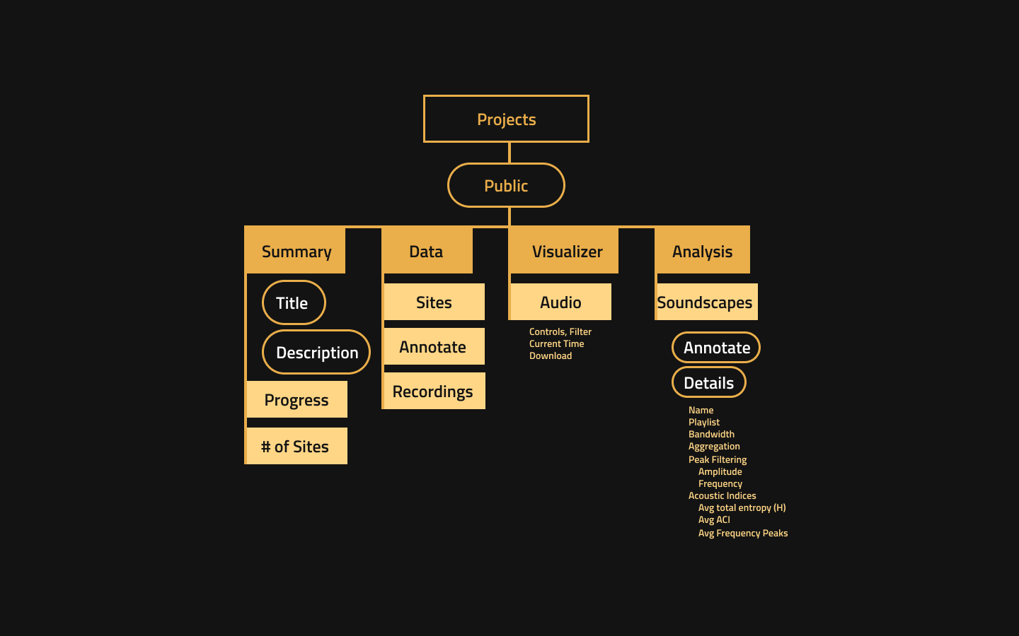
The modified Information Architecture ended up looking like this:
Additionally, to fulfil our stakeholders' needs we added a section for analysis. We mapped out thee data from Arbimon, the database for eclipse soundscape information:
We identified the most relevant variables by the amount of data present and narrowed it down to this:
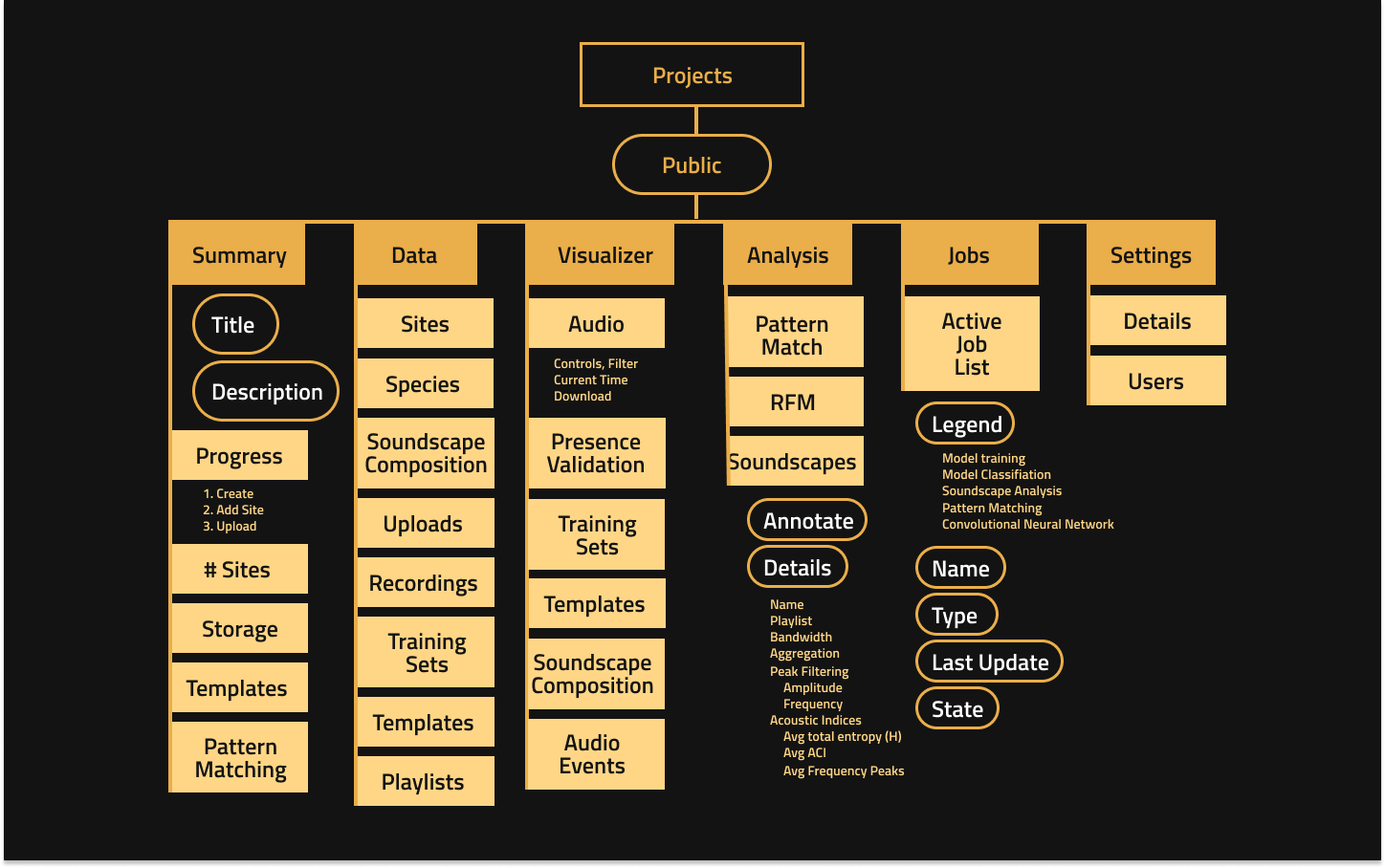
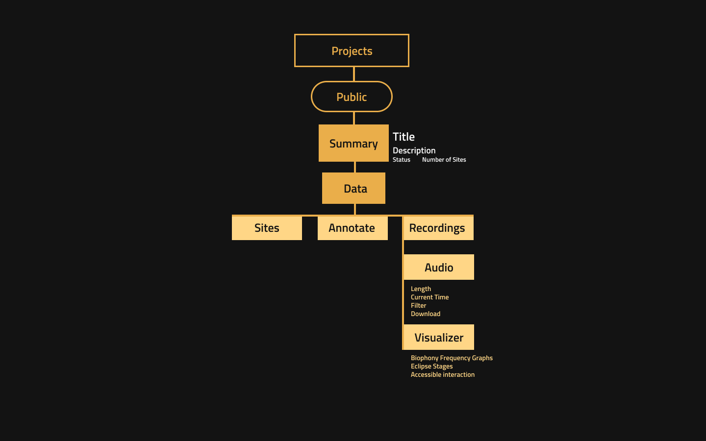
This was the data we put into our analysis section. The information architecture for it looks like this:
To consolidate the data into a screen and format that is easier to reead and analize, we rearranged the information architecture to look like this.
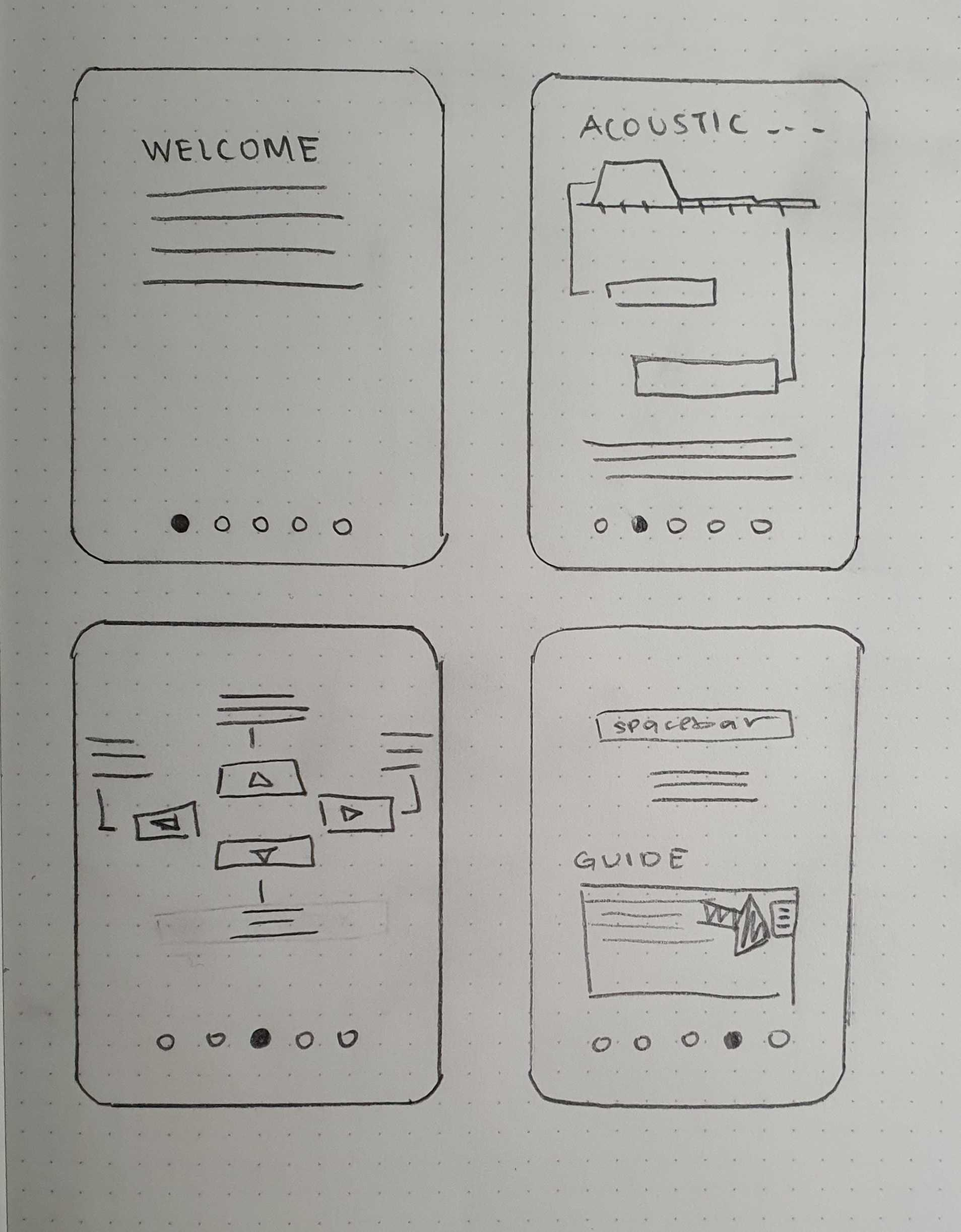
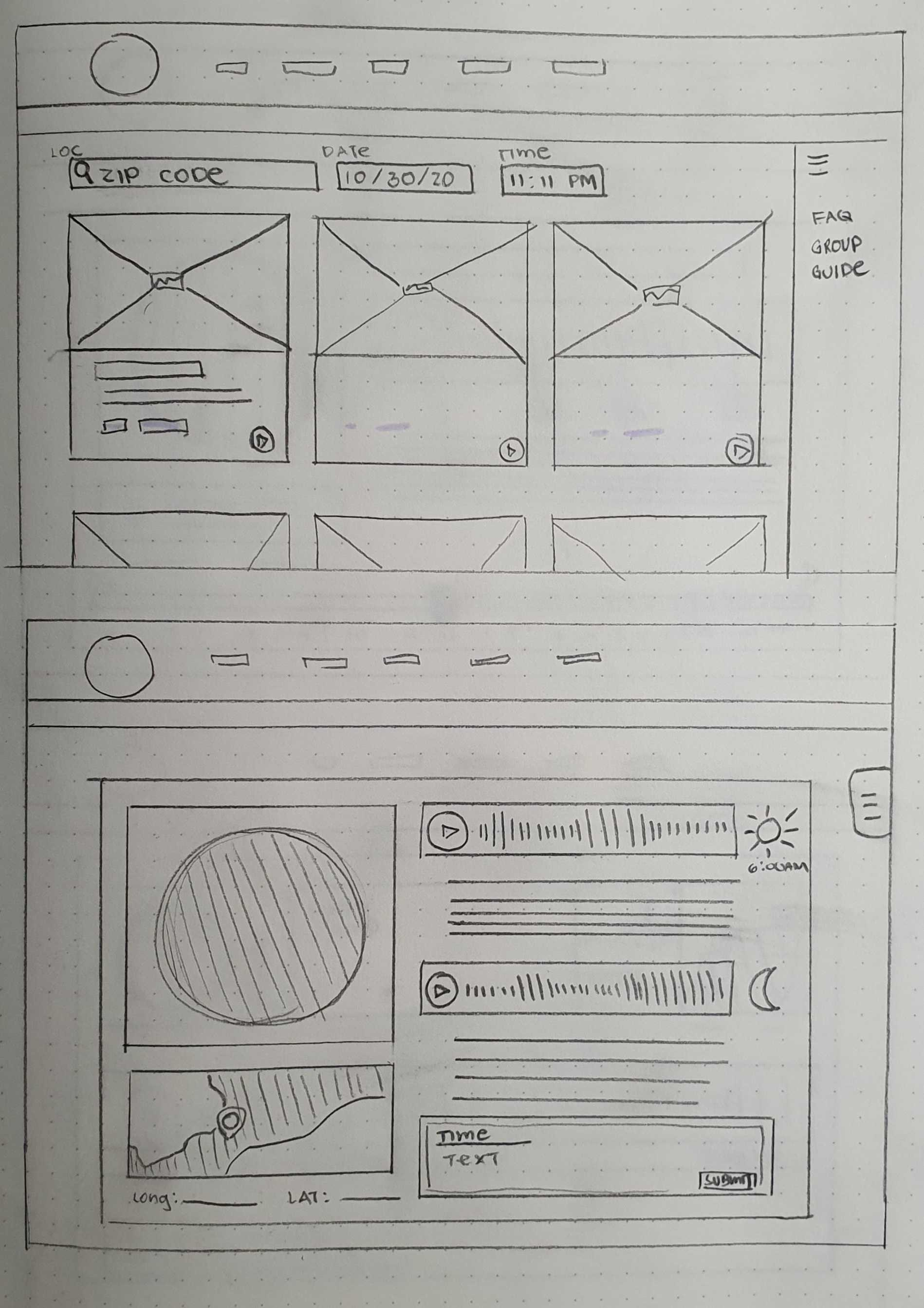
Wireframes
From the other citizen science projects we researched, we decided to add an onboarding screen and a field guide. Amongst the wireframes, we identified the simplest and easiest to navigate and the most organized and prototyped that.
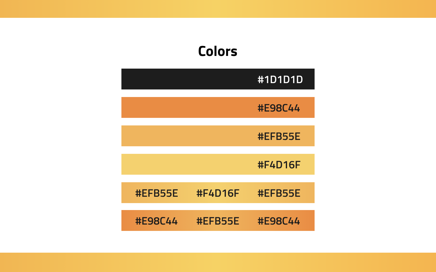
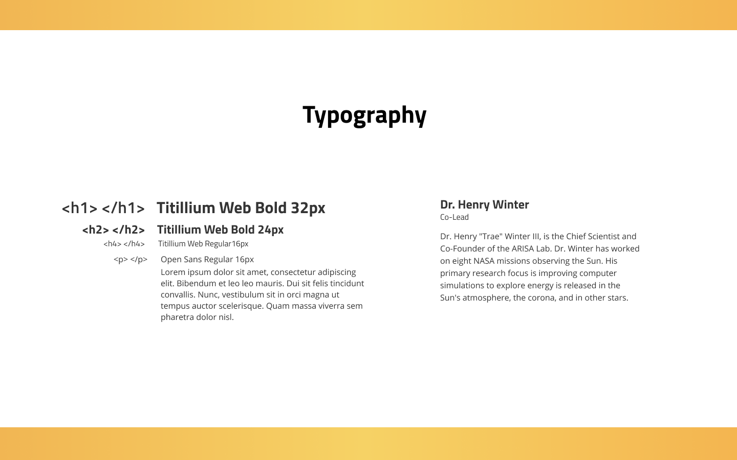
Design System
In our prototypee, we took into account the design system the project was already using including fonts and colors. We also took into consideration the HTML elements to make the process of customizing CSS a bit easier.
Prototype
Onboarding - to quickly brief our users on eclipse soundscapes since we found this data to be crucial in user understanding and retention from our surveys.
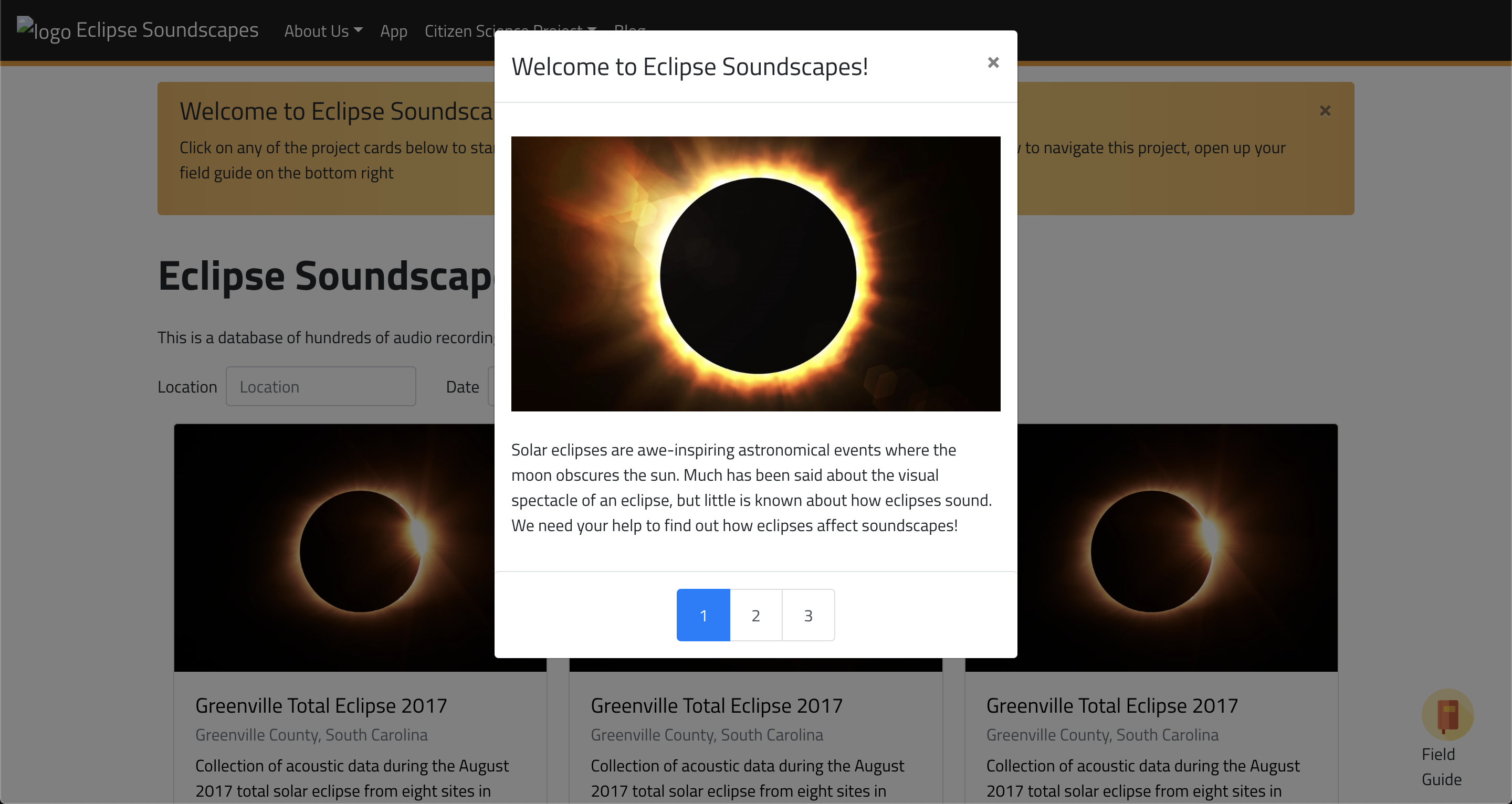
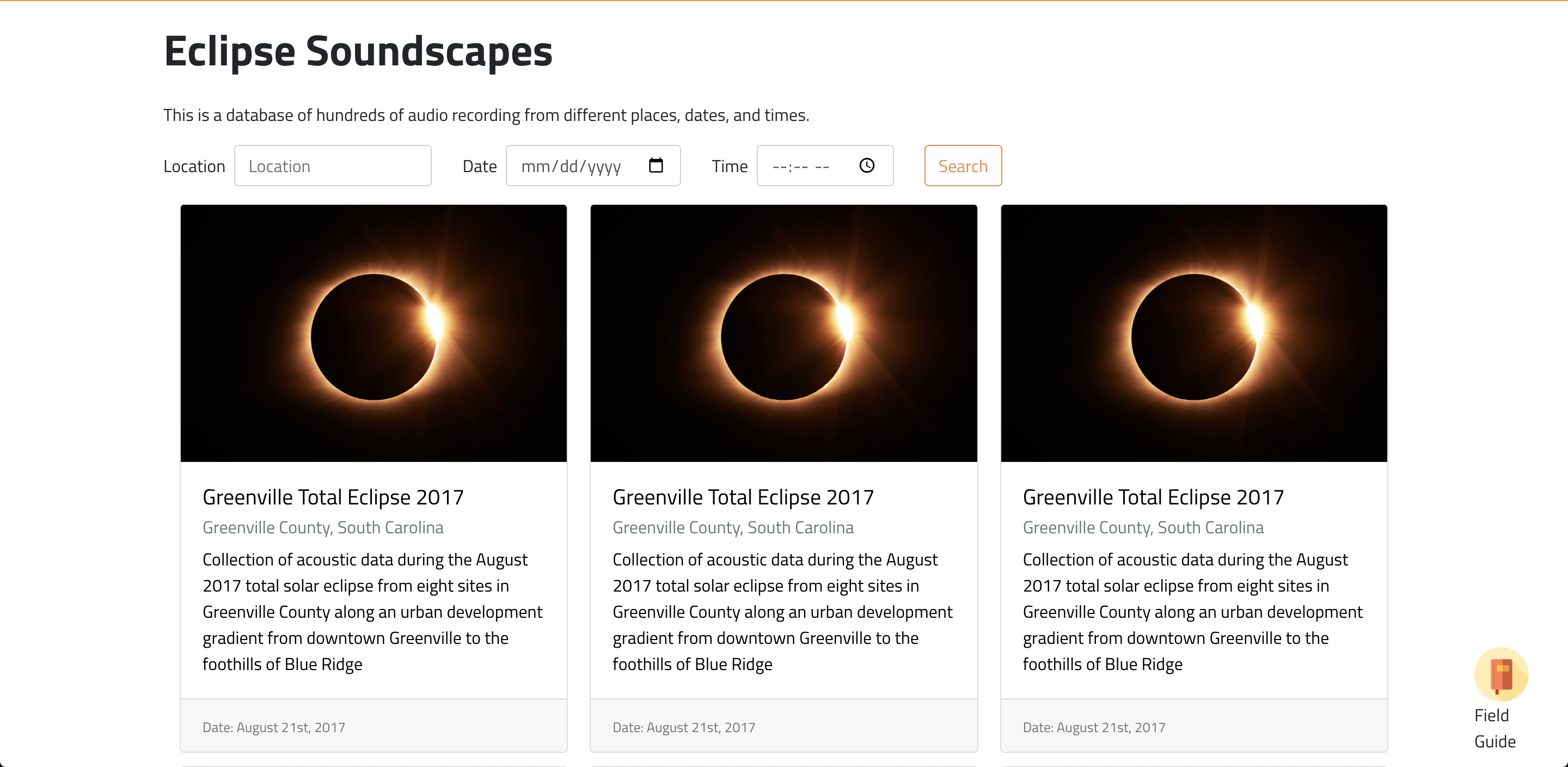
Main Page - displays different eclipse soundscapes that users can explore; can be filtered by date, time, and location.
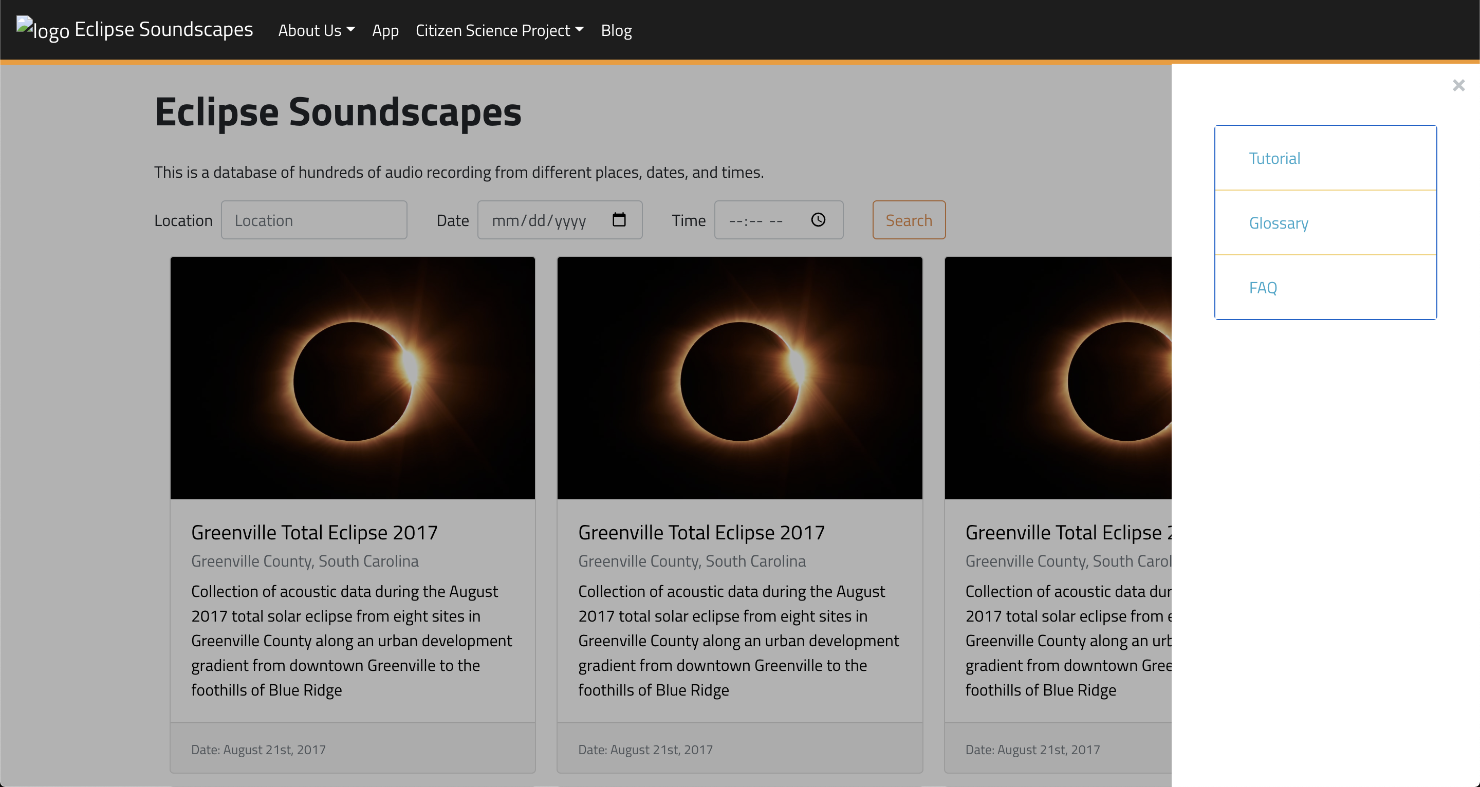
Field Guide - an reference guide that helps users easily access eclipse soundscape information they may need to know.
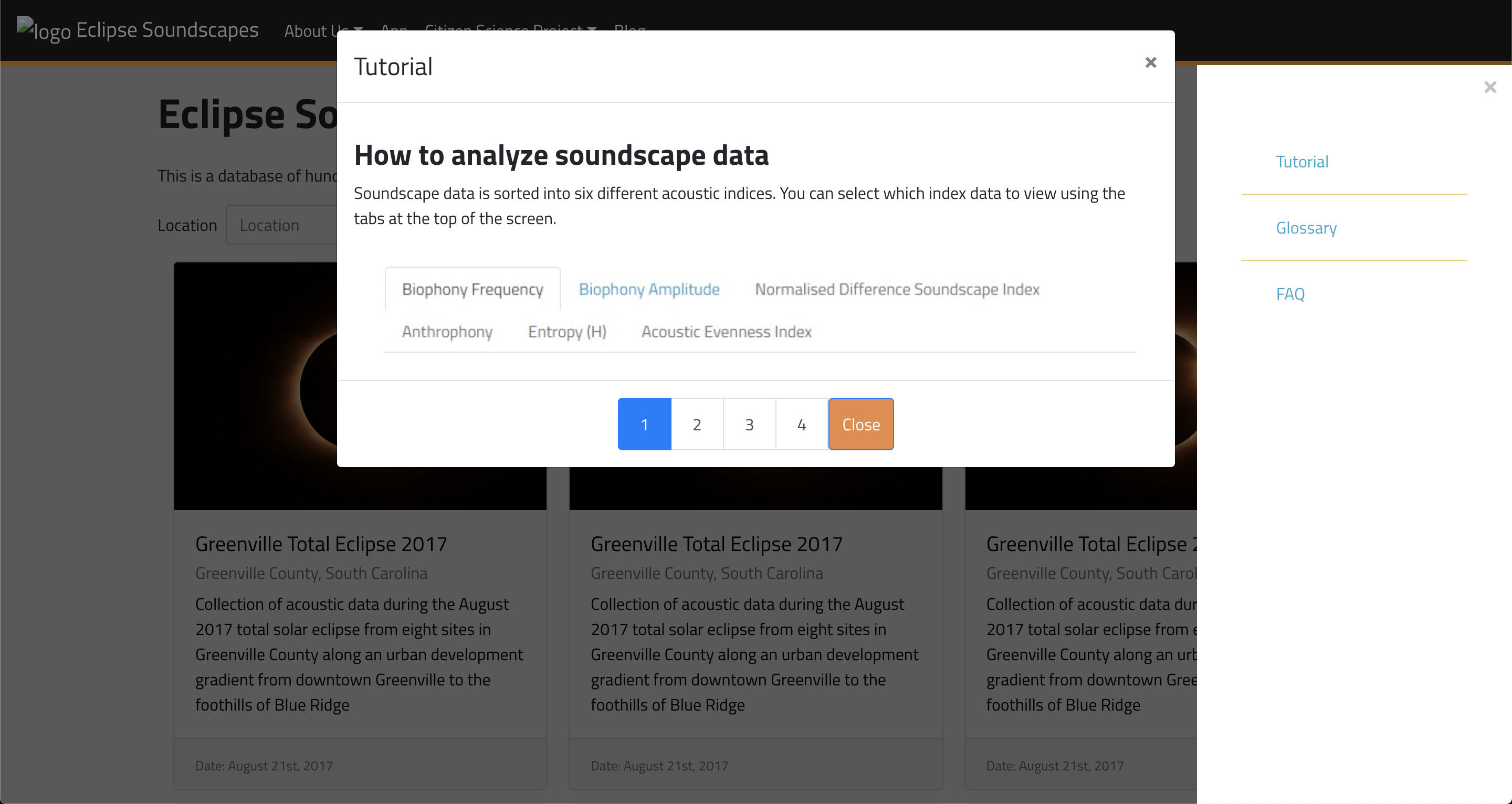
Tutorial - a tutorial on analyzing soundscape data in order to get users to participate
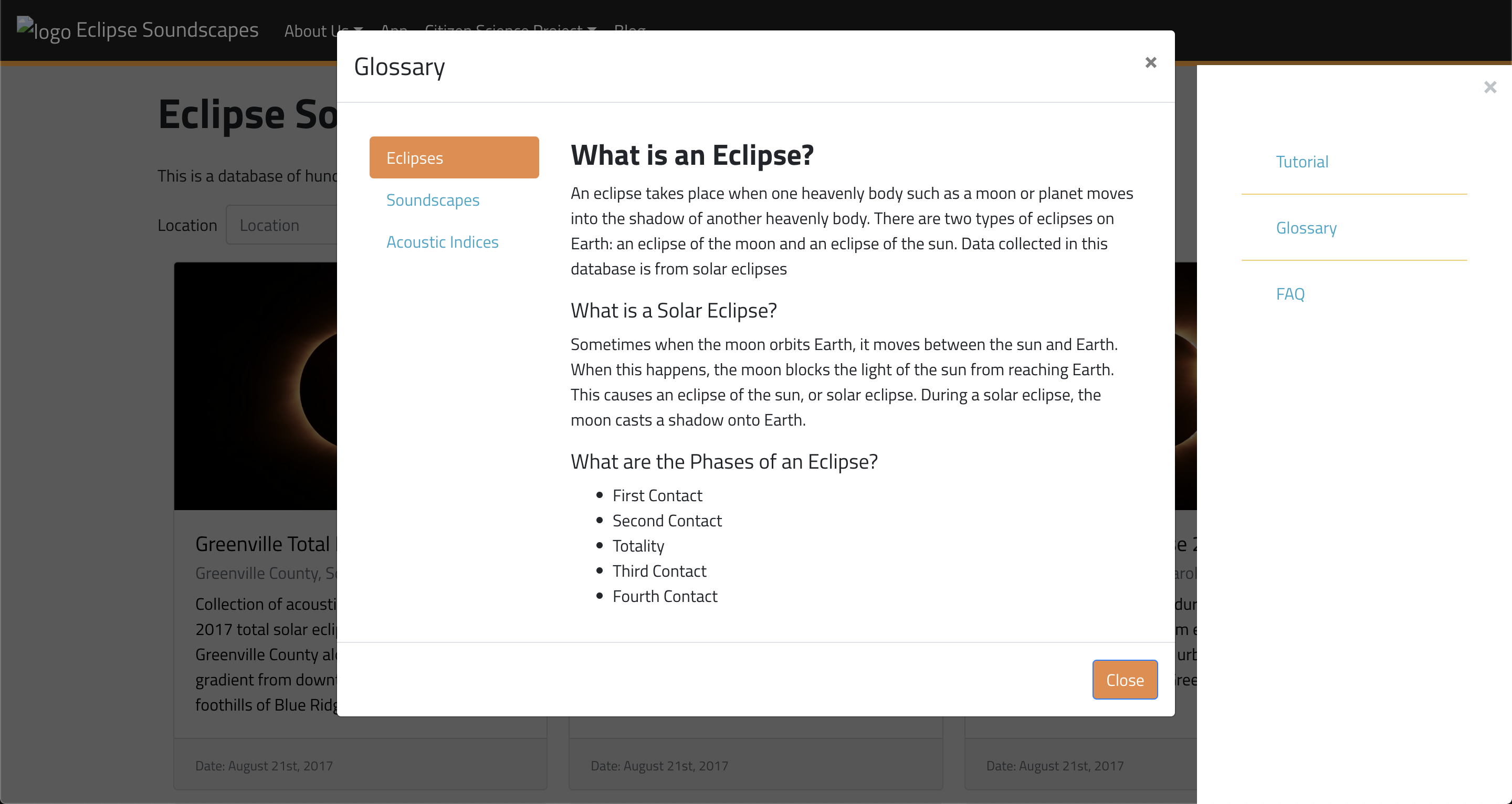
Glossary - a glossary that helps new users understand language used in eclipse soundscapes.
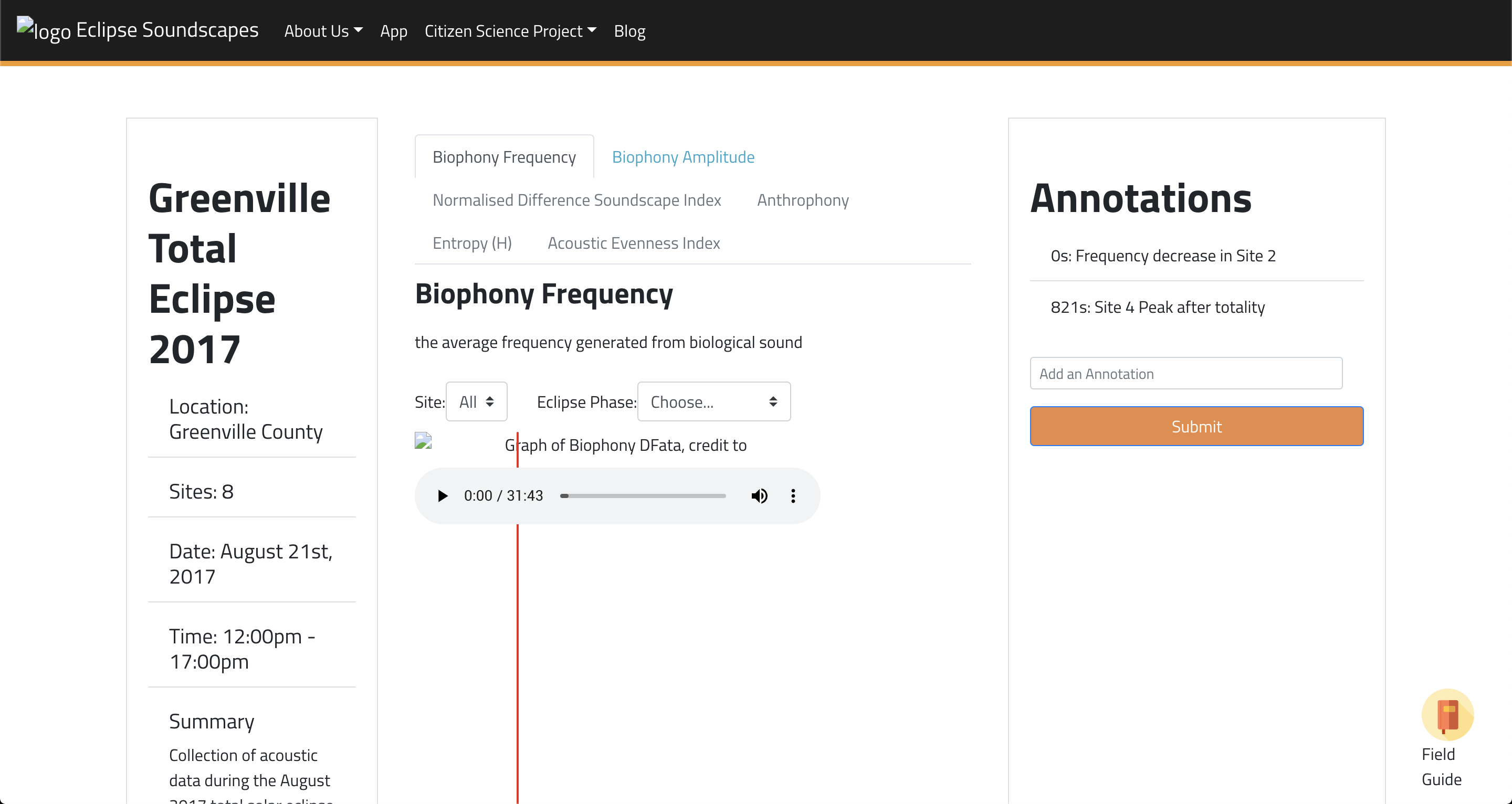
Analysis - ways to analyze soundscape data with an easy and accessible way to annotate findings by simply typing and hitting enter. This allows the user to keep hearing the sound and typing in their observations simuultaneously.
In this prototype, we fulfilled the 3 "must-haves" provided to us by our stakeholders.
- Main page - The ability to search for eclipse soundscape data by date, time, and location.
- Analysis - Analyze eclipse soundscape data by allowing users to experience how some parameters over time.
- Field guide - FAQs relevant to searching and analyzing data
Lessons x Future
Compromise
We had to make compromises.
As an example, our project could have utilized way more research and could have been more complex. It could also have had a feature allowing users to easily compare the sounds before and after an eclipse. However, at the moment, we had to simplify and focus on the MVP and stakeholder priorities. This meant creating a usable product without all the necessarily cool features, but has enough of the useful features to make it easy to understand and use while fulfilling a need.
Accessibility
Designing with accessibility in mind helps us all.
Allowing users to easily type while heearing the sounds helps the visually impaired since it relies less on mouse clicks or navigating/tabbing through the page. This ends up being useful for everyone.
Usability Tests
Ideally, we would be able to test our prototype and measure its performance against our KPIs. This will allow us to further iterate on our prototype.
Extended Experience
Looking back, it is interesting to think of designing for extended experiences; such as braille readers, apps, and considering more ways to visualize sound; allowing more involvement and opportunities from people across all levels of understanding, financial capability, and ability.